
Rebranding Concept
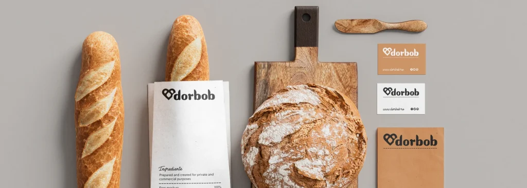
Project type: Rebranding
Role: Brand designer
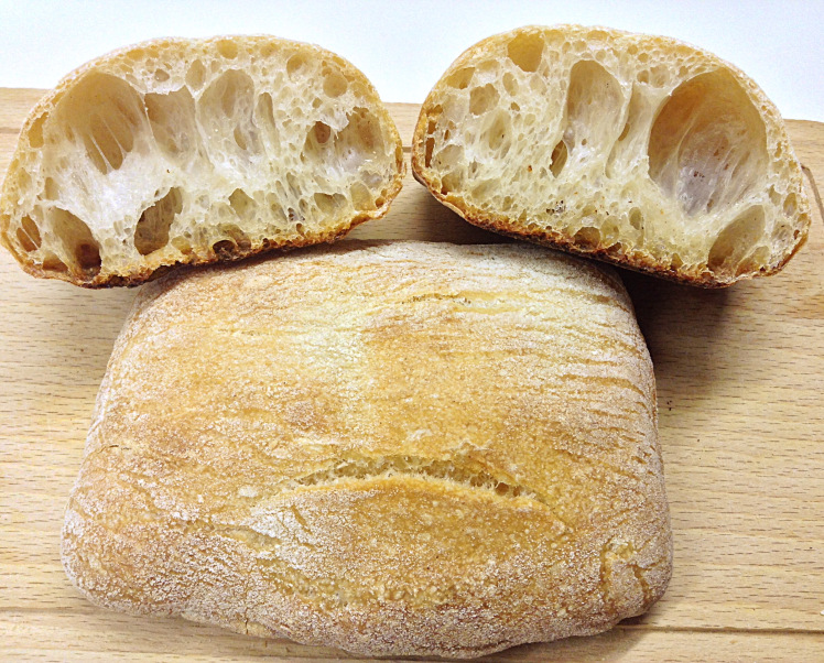
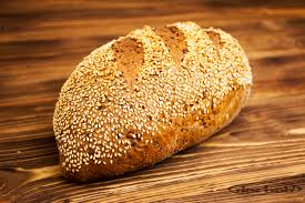
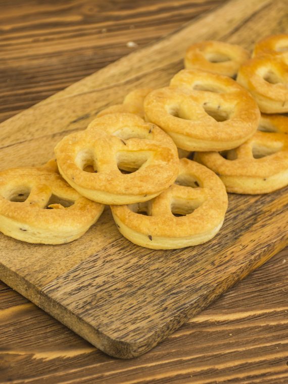
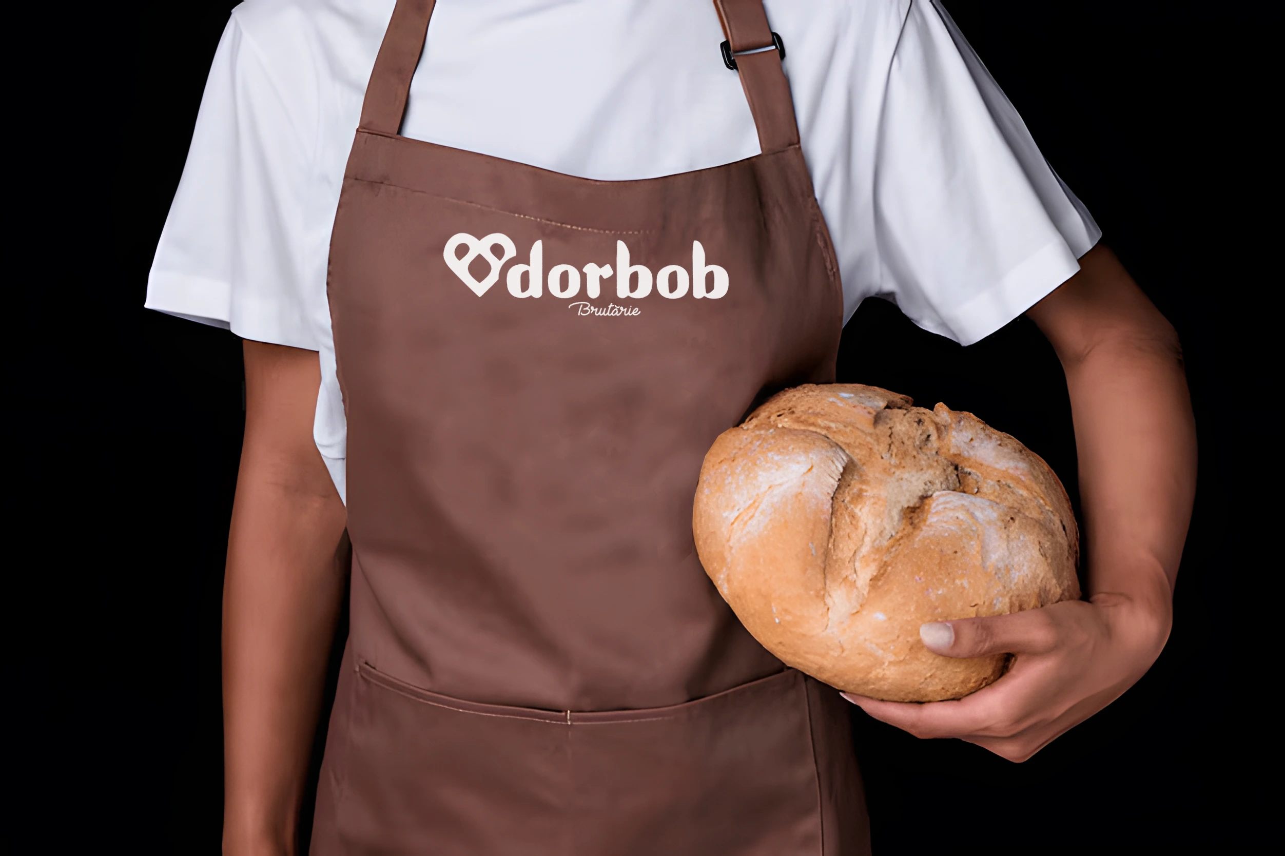
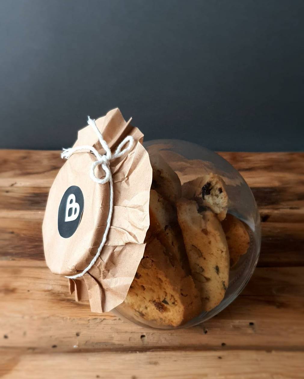
Industry: Food, Bakery
Tools used: Illustrator, Photoshop.
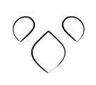
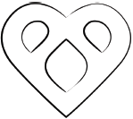
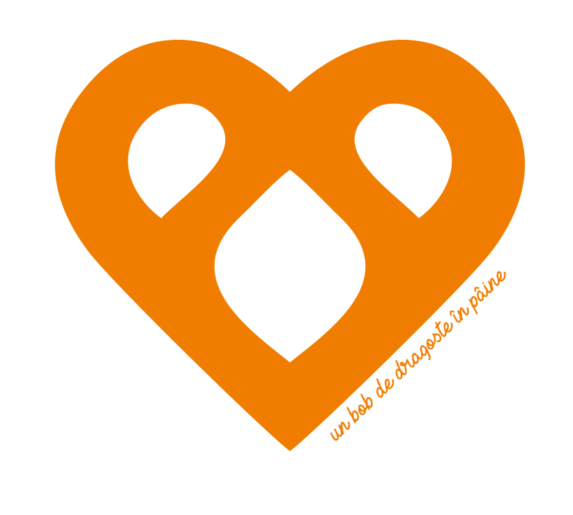
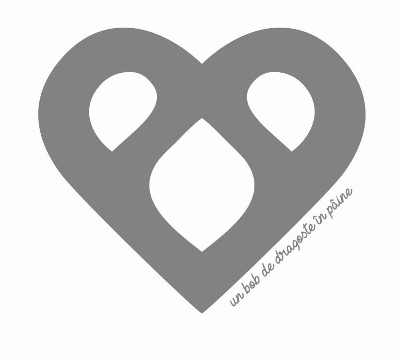
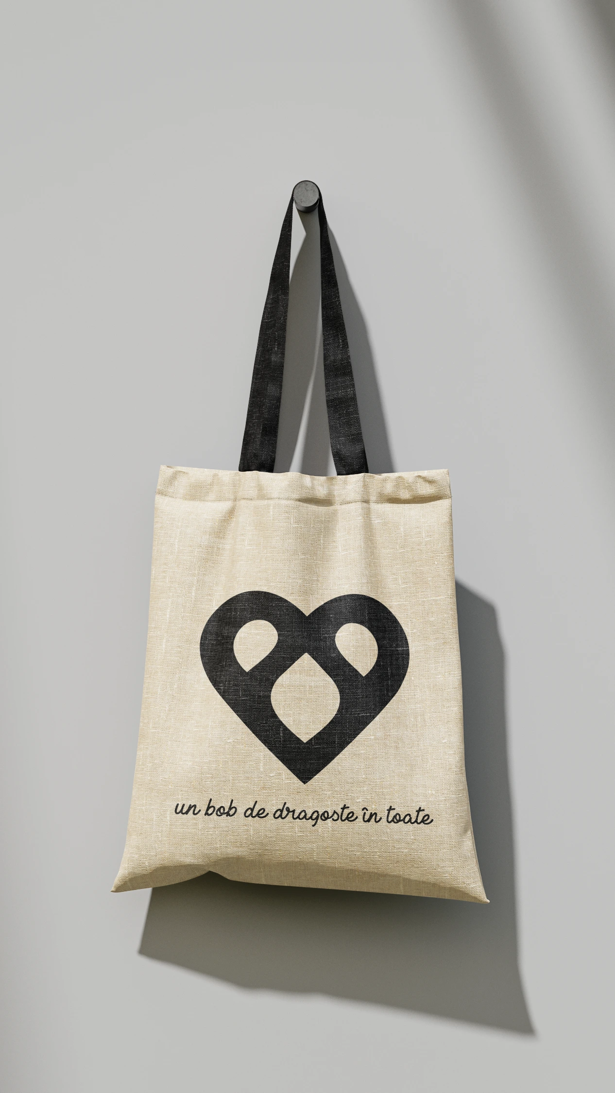
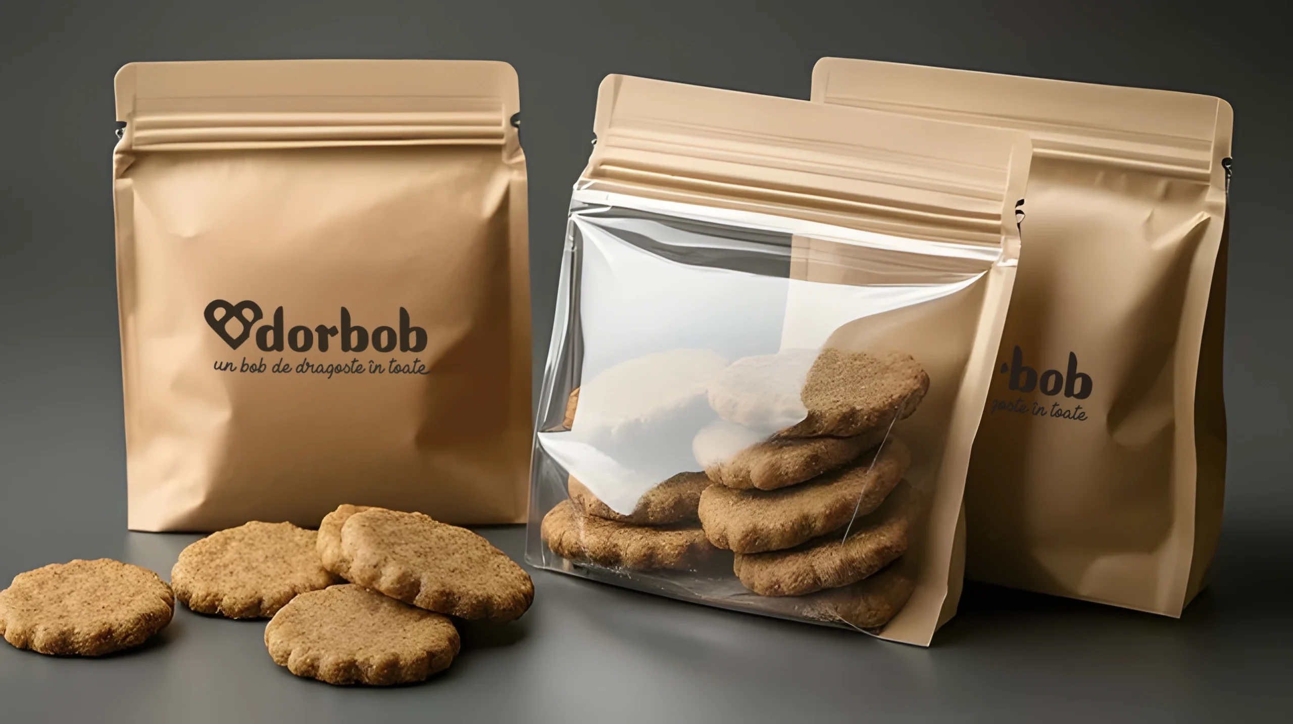
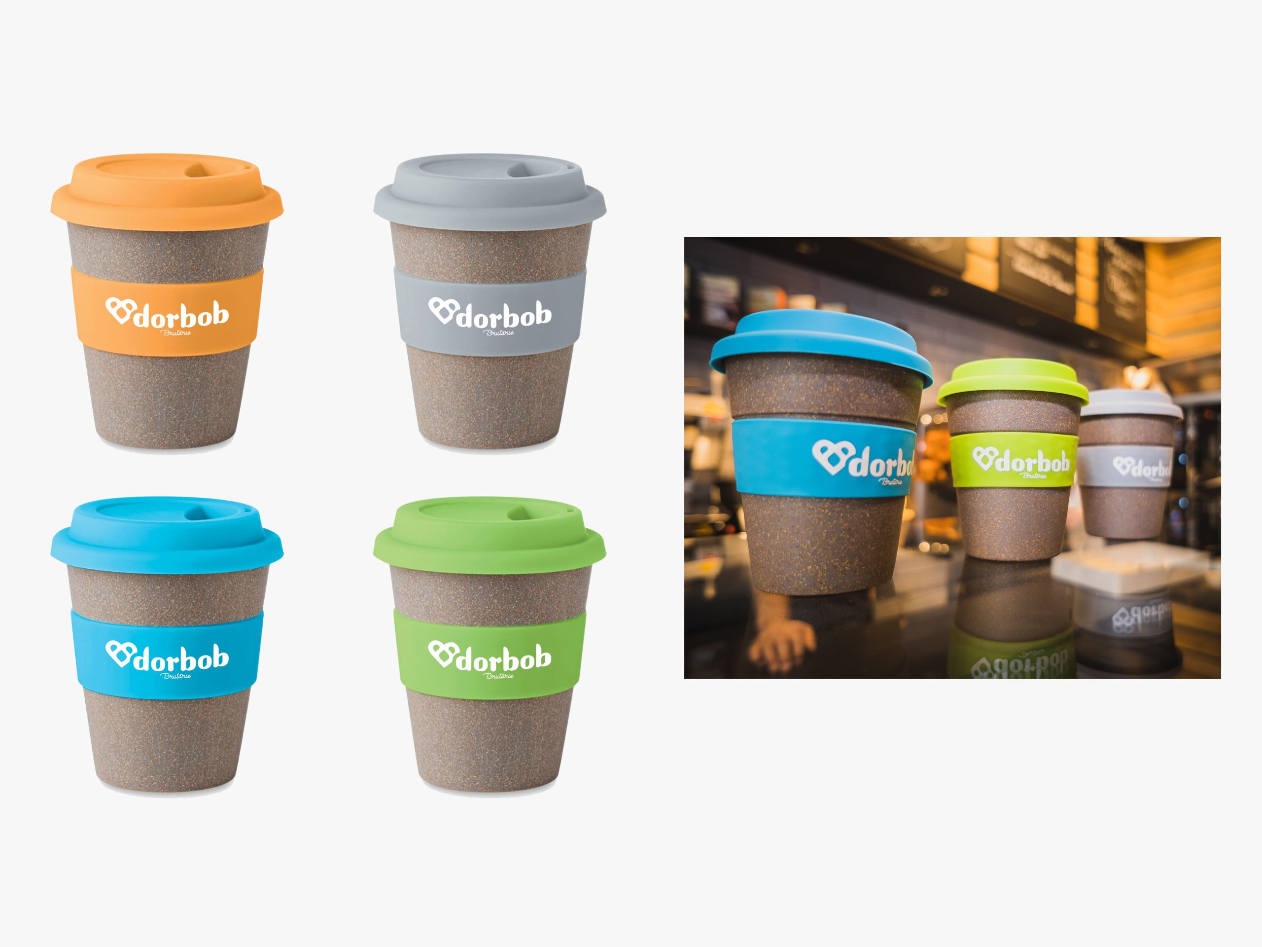
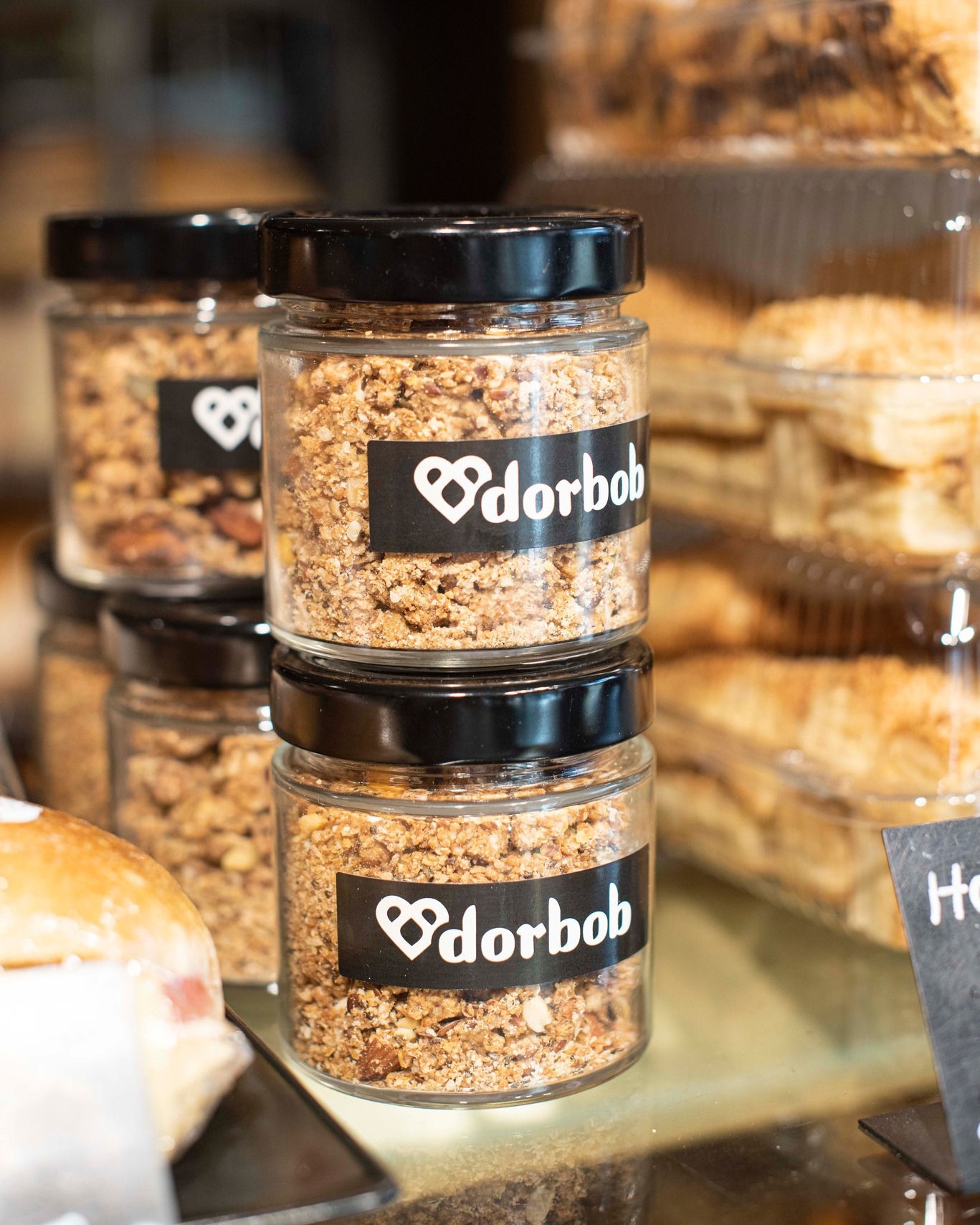
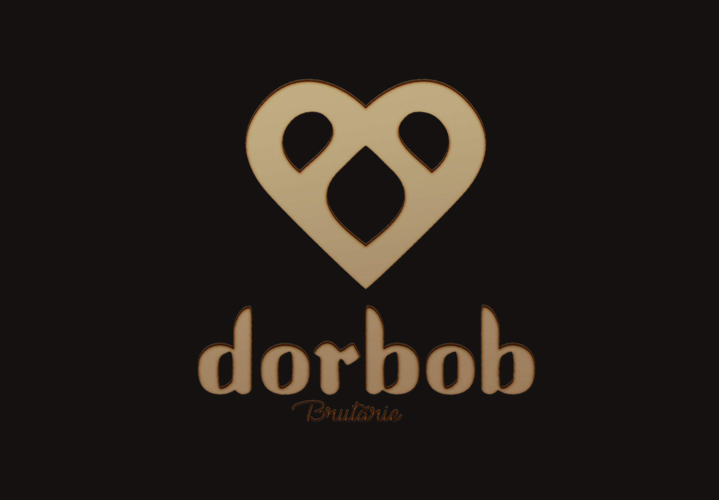
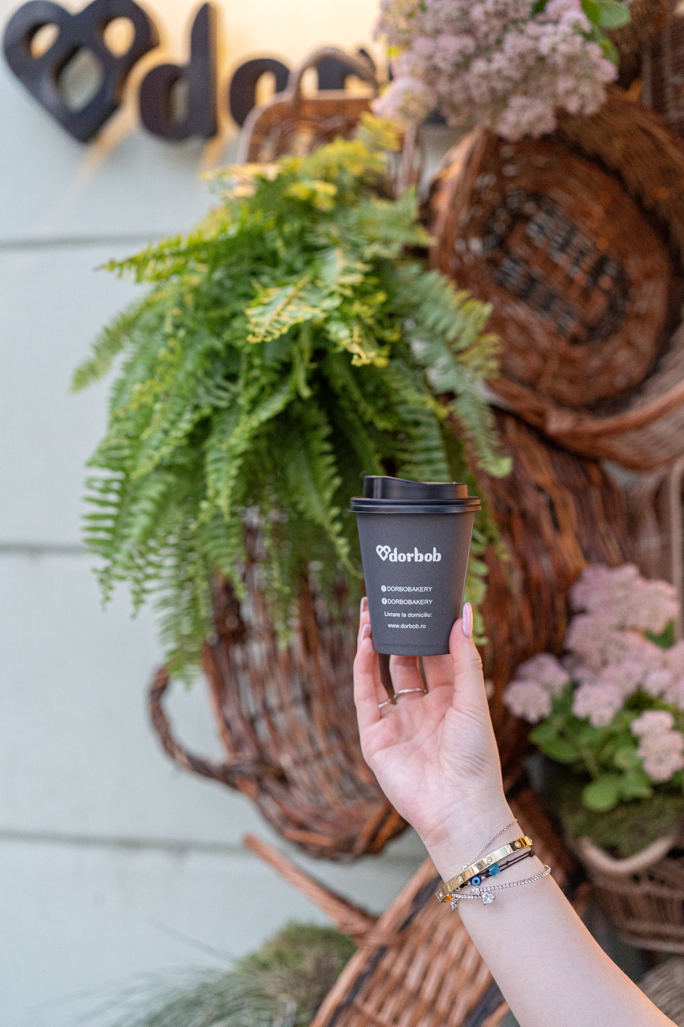
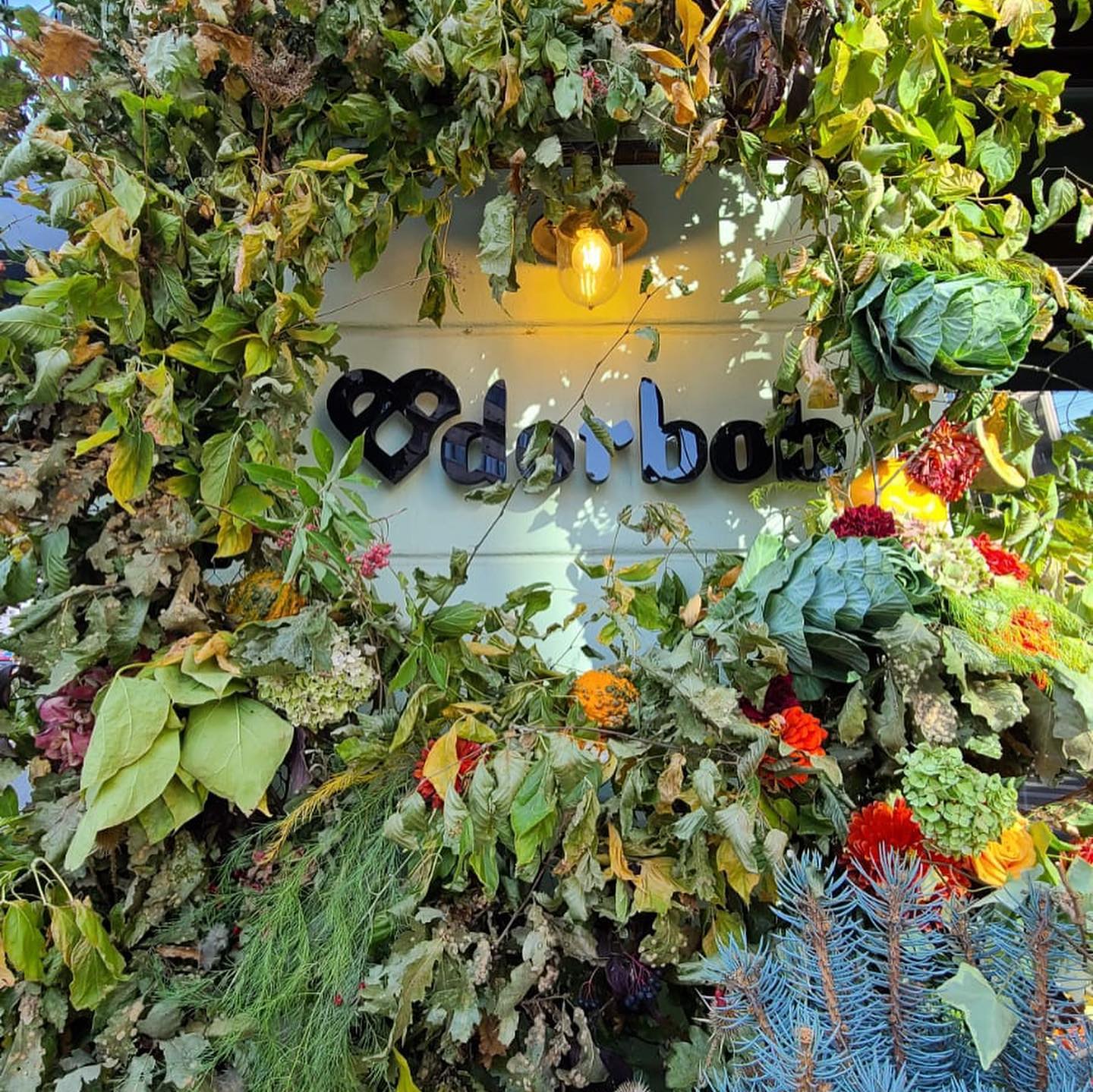
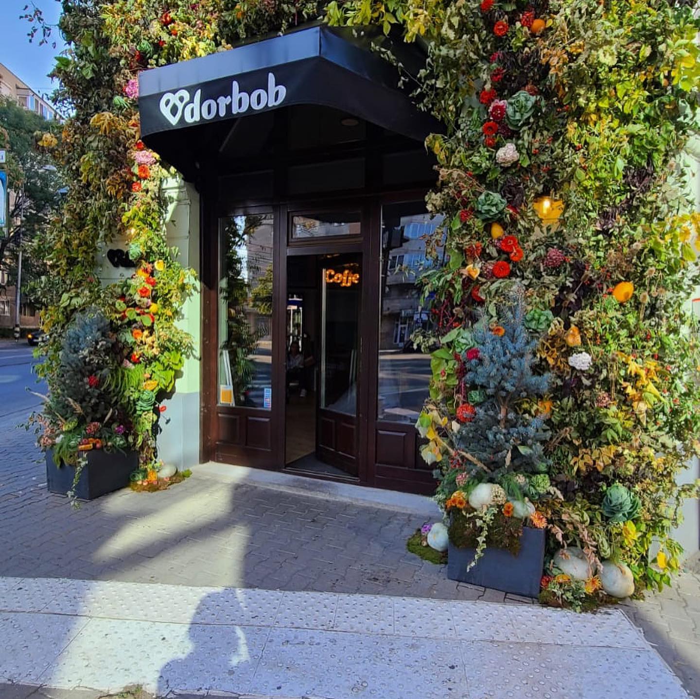
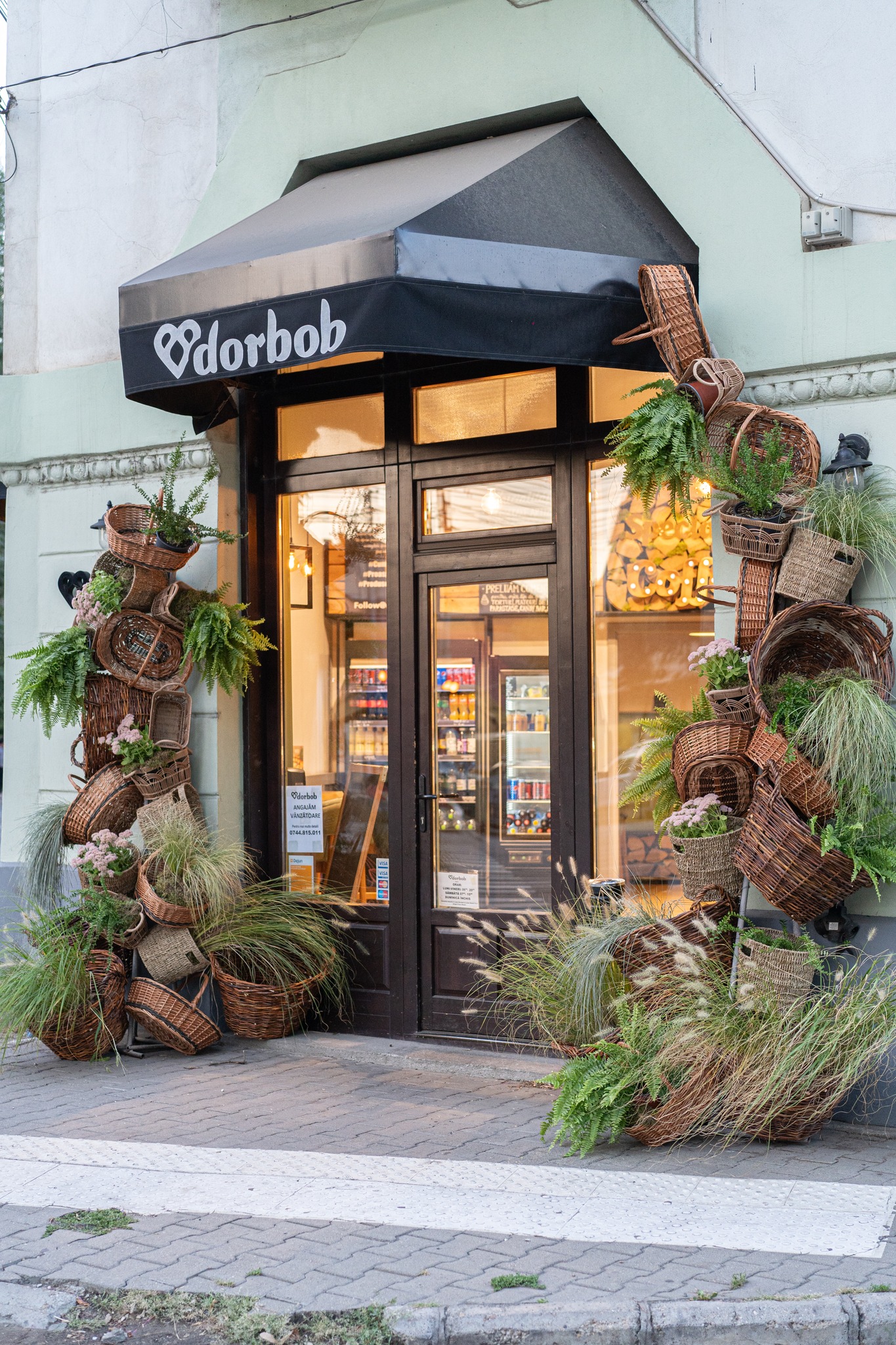
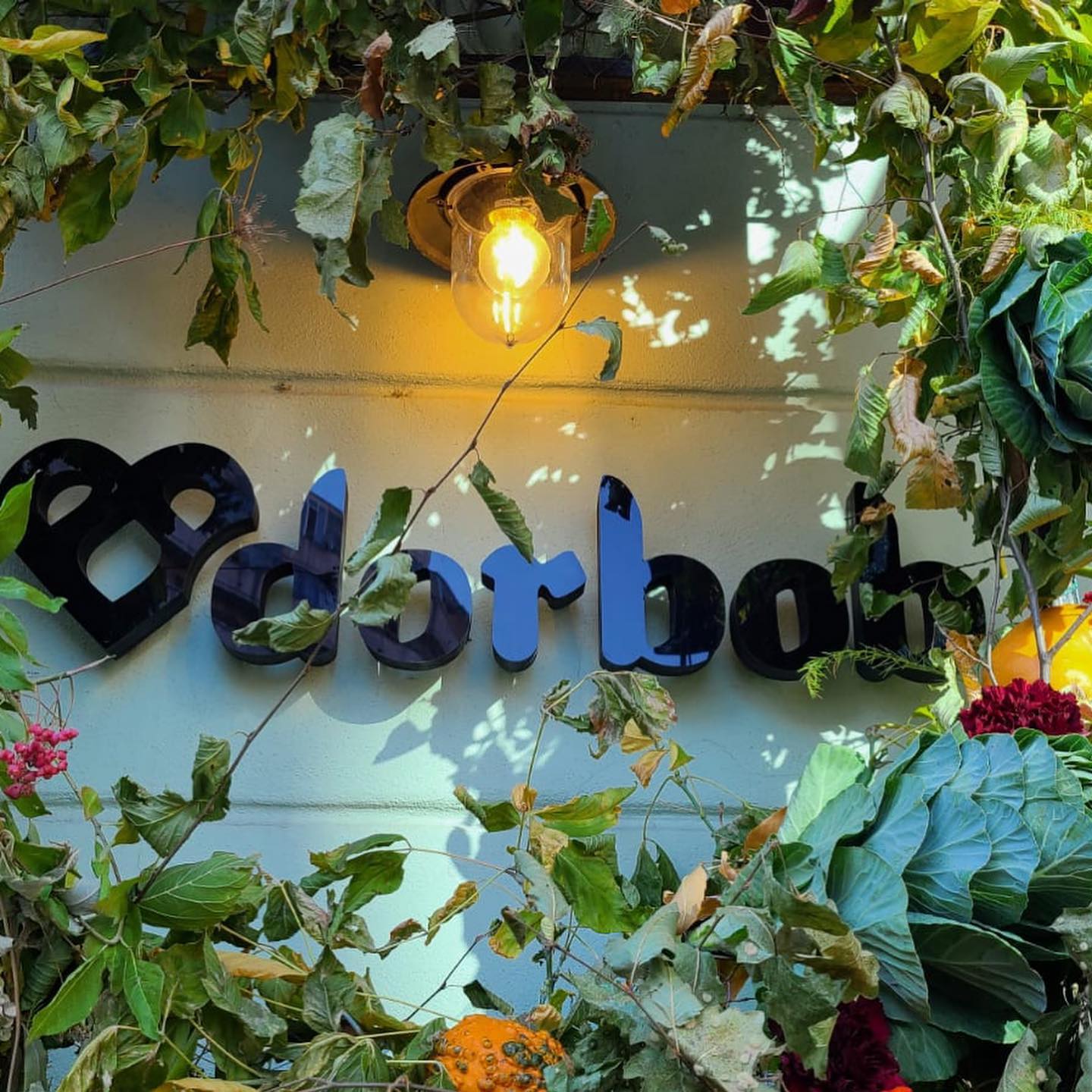
The shape of the entire visual concept “dorbob” encompasses numerous symbols and gives meaning.
An identity was created that best represents the company producing bakery products by creating a graphic sign composed of several symbols.
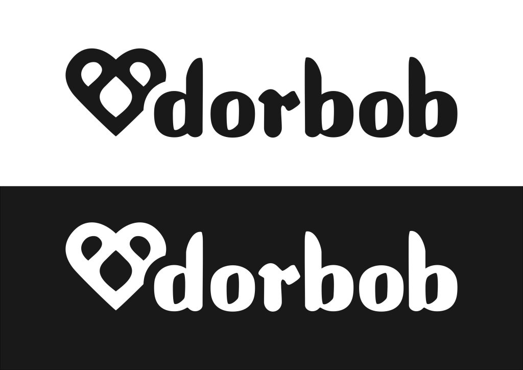
The character of the letter “dorbob” is born by combining 2 formal styles:
a Sans Serif Bold character, which also contains the shape of a Celtic letter character, precisely in the idea of rendering an archetypal image of ancient
writings. This was joined by a calligraphic font, linear in the writing of the word “bakery”.
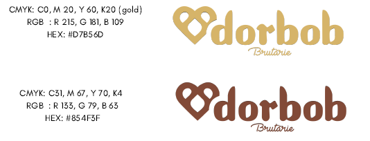
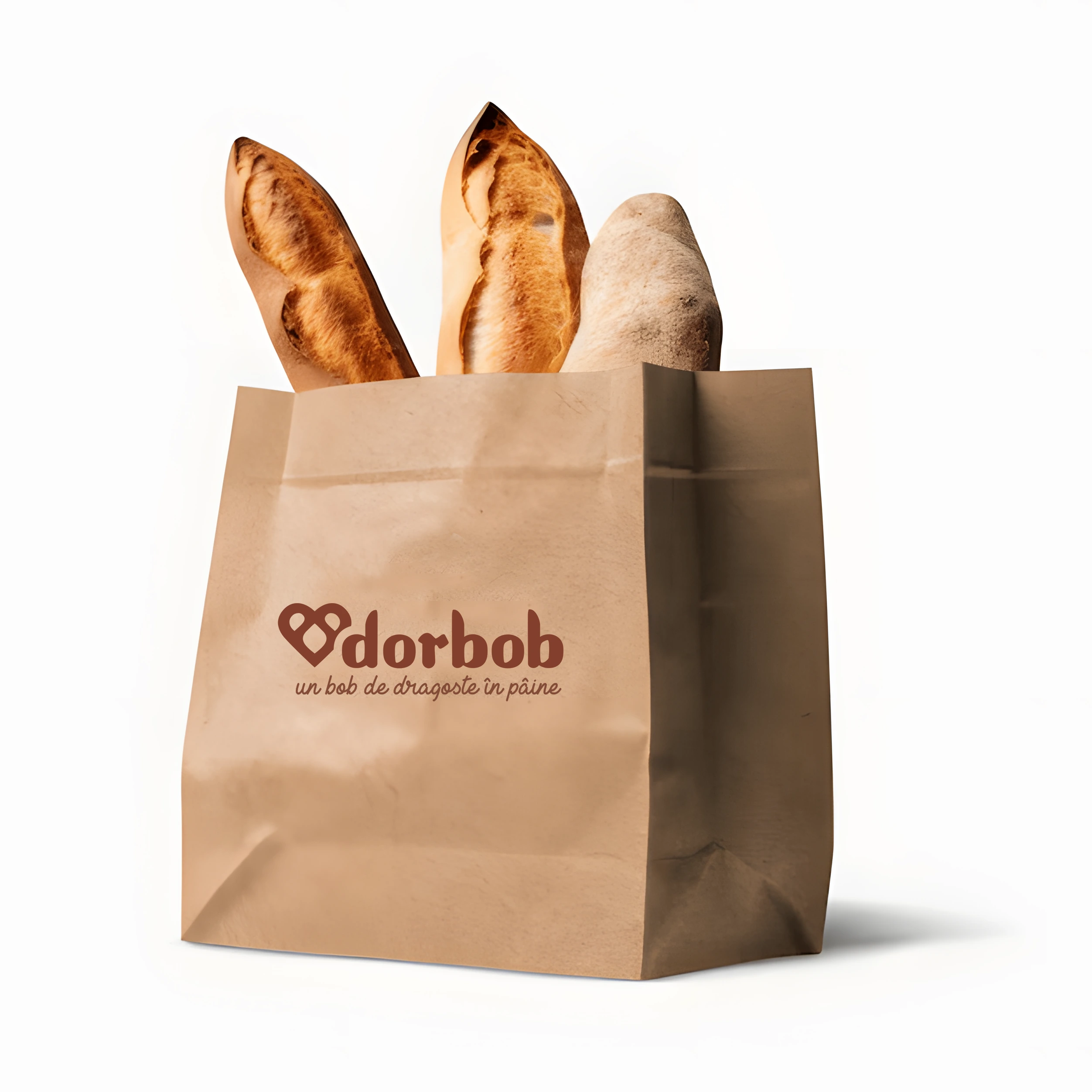
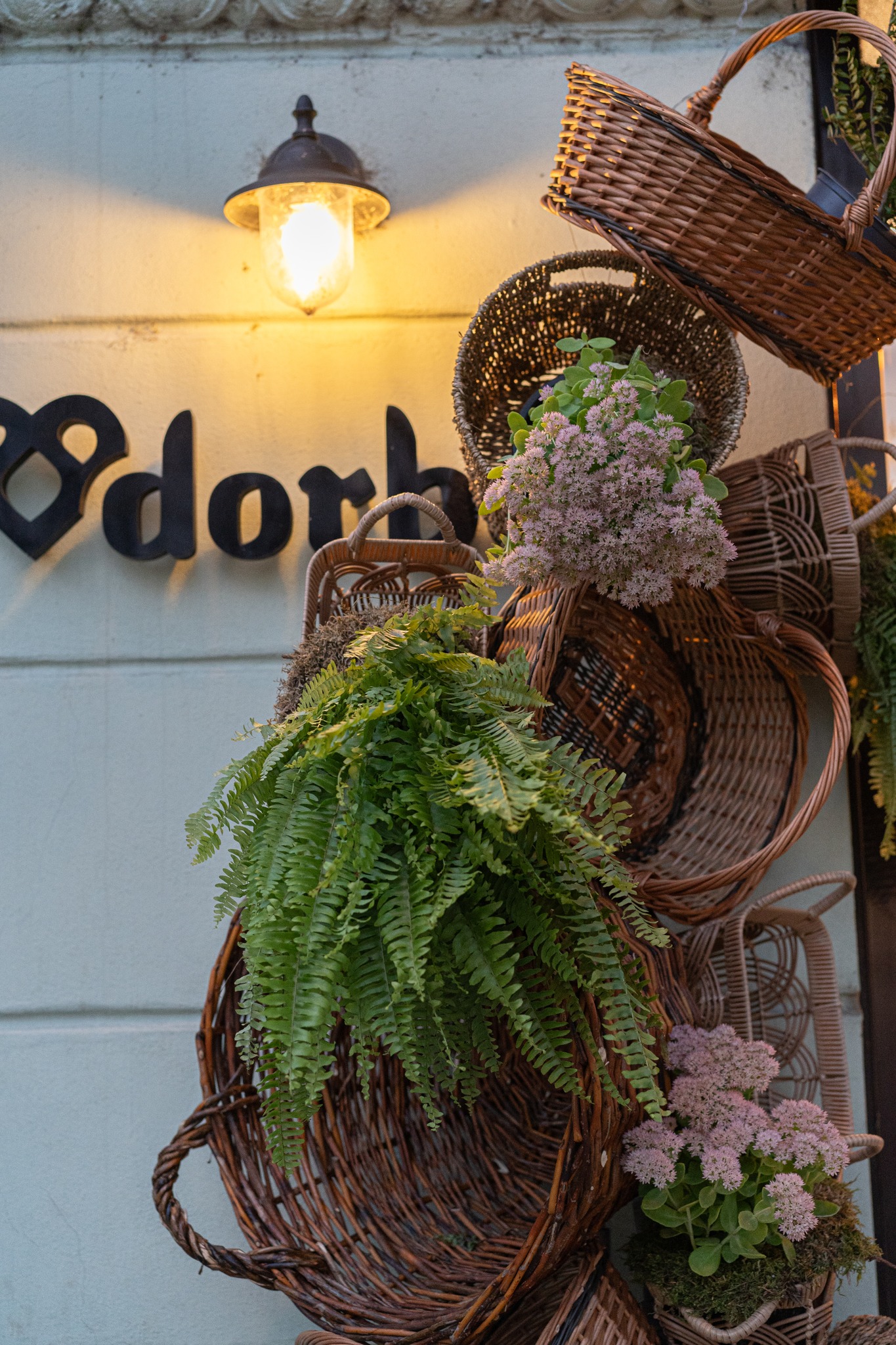
The old logo it represents an local bakery with over 15 years of experience. So because the brand was already known by a lot of people I decided is better to blend a little the old and the new visual and to keep some forms and colors that can remind of the old one. By this concept the will be better received by the clients and it will not be interpreted as a new brand on the market without history.

Concept & Logo Elements
The new Dorbob logo preserves the warm, artisanal feel of the original — it respects the bakery’s roots while refining forms for a cleaner, contemporary look. The softened serif and rounded shapes evoke tradition, but feel well-balanced and modern. Circular elements in the “o” letters and subtle curves mimic bread grains or a loaf’s cross-section. This motif creates an immediate association with Dorbob’s core product: wholesome, freshly baked bread. It’s a simple yet effective visual shorthand. Reducing ornamentation and focusing on craft-focused typography gives the logo more breathing room. It looks sophisticated and versatile—equally suited to packaging, signage, digital use, and small-scale applications like social icons. The warm, earthy tones (soft browns or cream-beige) reflect the natural ingredients and comforting warmth of fresh bread. It’s not just aesthetically pleasing—it’s an emotional cue for tradition, care, and quality.
Line
In traditional thinking, bread and the roll concentrate a symbolism in a beneficial totality: joy, fruitfulness, abundance, fertility, purity. The “making of bread” or of the rolls marks, in fact, the entry into the celebration, purifying the beginning of the period through the ritual values of the dough and solemnizing the festive time through the presence of bread. The first phase of the transformation of flour into bread, the sifting, follows rules specific to a ritual act: it must be carried out in the morning at dawn, “without eating”, in complete silence. I wanted to create symbol of the vital force through which the dough comes to life, “springs”, “blooms”, “grows”, the leaven revives the dough – it “leavens”, becomes “alive”.
Shape
Heart – symbol of lasting existence, designating the emotional, moral, intellectual or spiritual core of the human being. represents the dedication and passion that exists in the process of making bread. The heart is the engine of life, the vital center of the human being and correlates very well with bread, as a symbol of essential food.
Symbol
Wheat, flour, dough and finally bread are loaded with meanings and symbols as old as they are present in the world of the village of old, being, as the case may be, a sign of joy, abundance, purity. The final shape of the graphic symbol resembles a bagel, seen as a symbol of luck, prosperity and spiritual fulfillment.
Chromatic Variants
Usage & Applications


