

- Branding
- Graphic Design
- Interior & Product Design
- Marketing
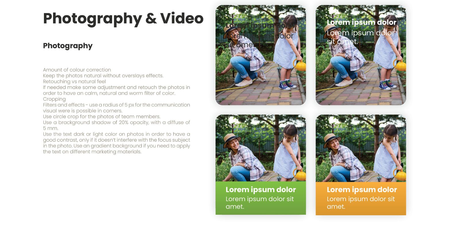
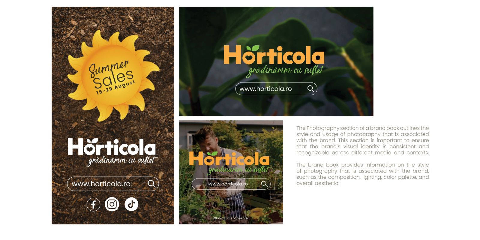
- Photography & Videography
- UX & UI design
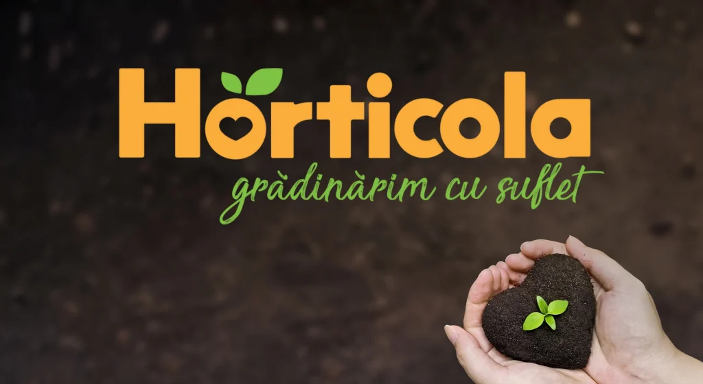
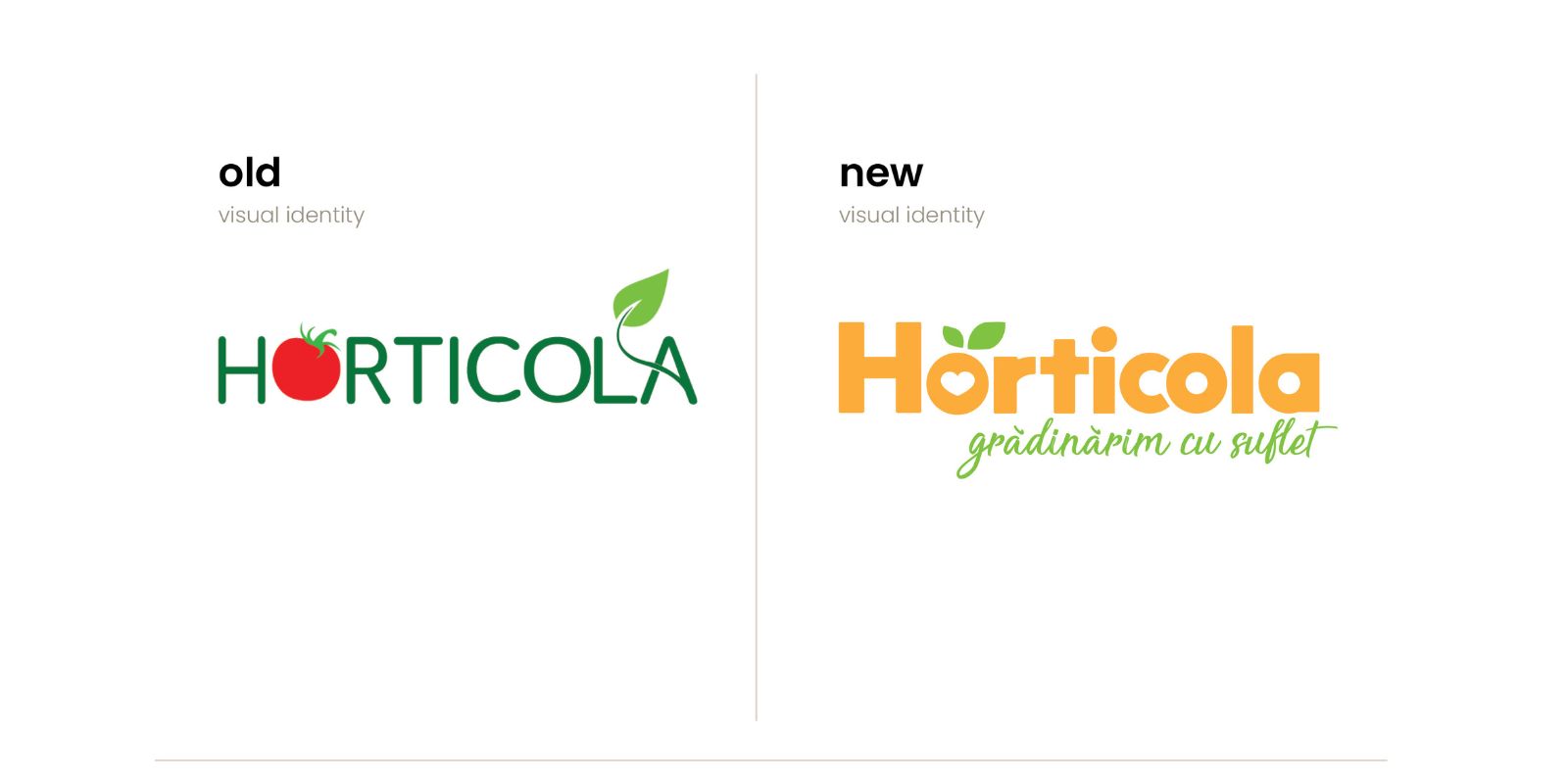
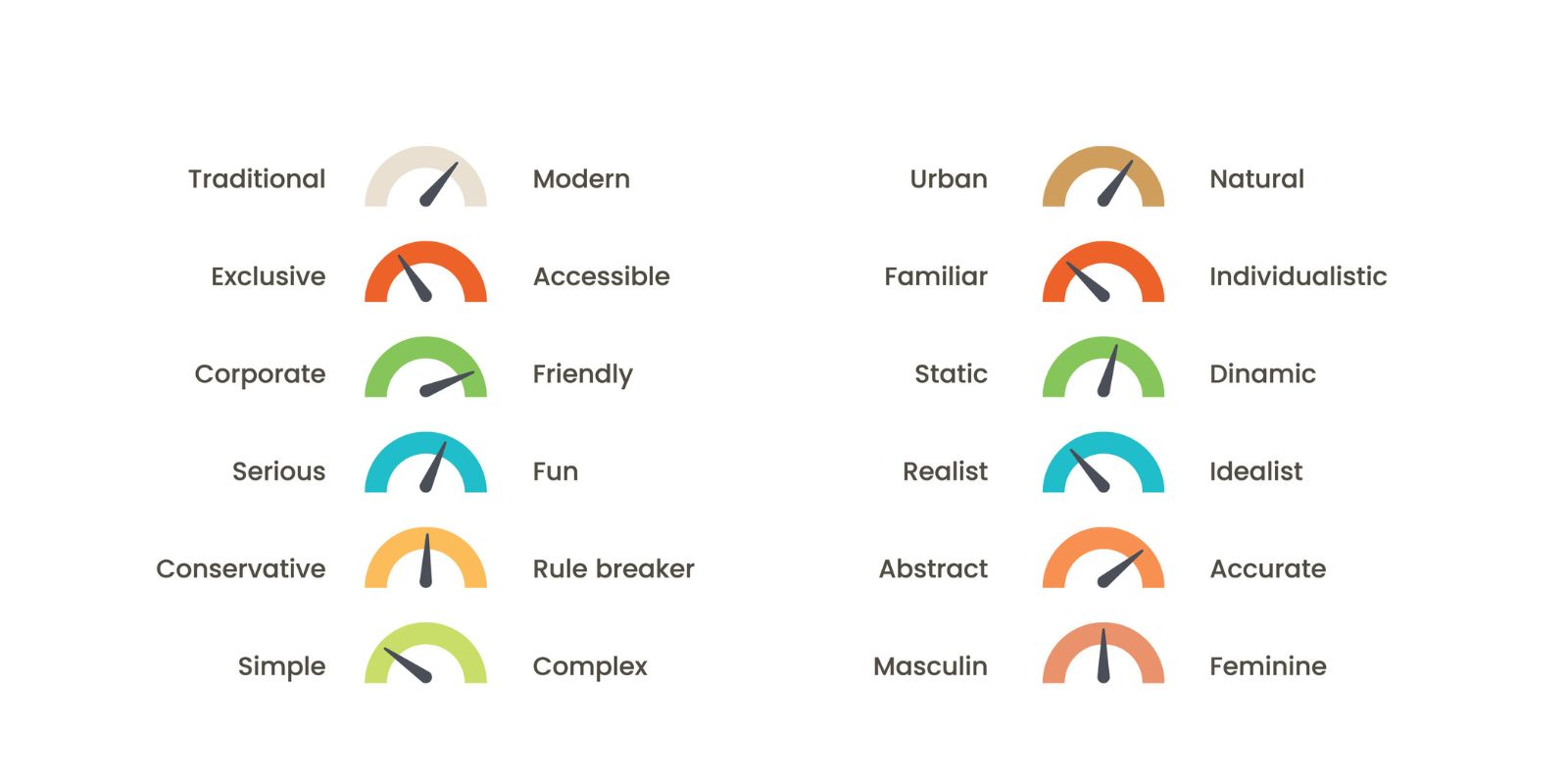
- Visual Identity
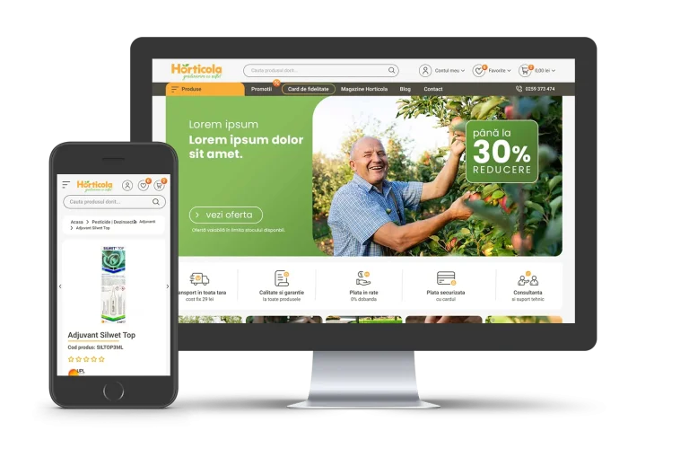
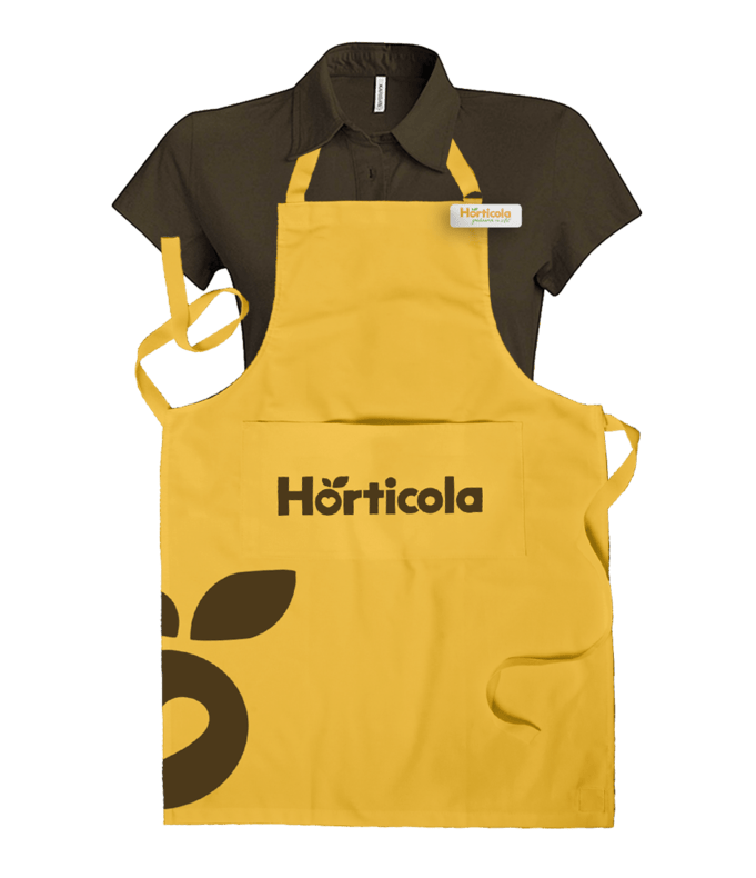
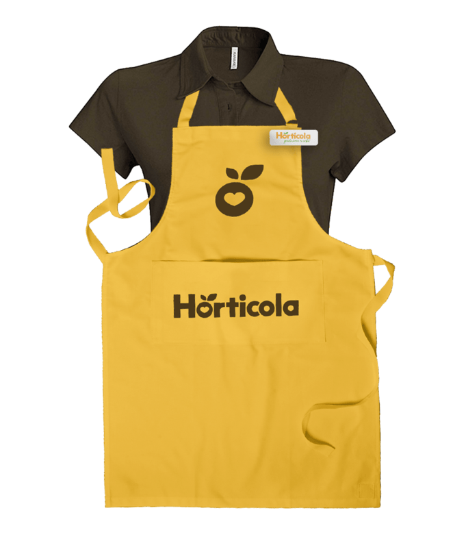
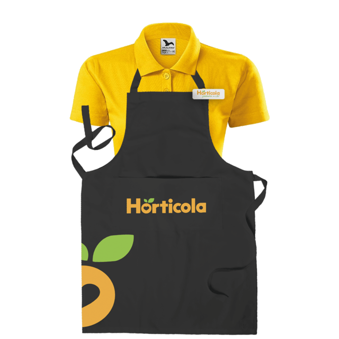
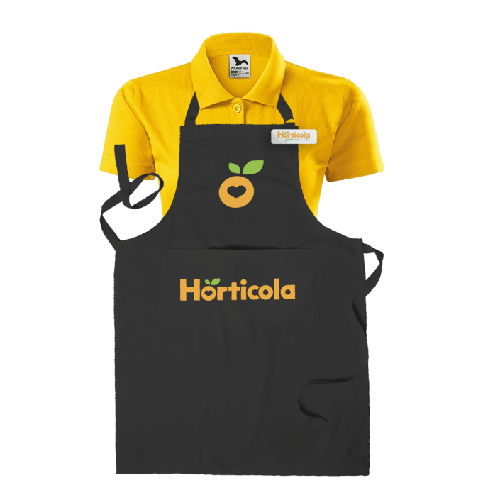
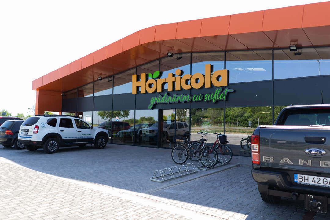
E-commerce UX&UI Project type: Online store UX/UI + branding Role: UX/UI designer & Marketing manager Industry: Horticulture, Home & Garden Tools used: Figma, Google Sheets, Google Analitics, Illustrator, Photoshop. Duration: 4 weeks Horticola.ro is an e-commerce platform dedicated to providing...
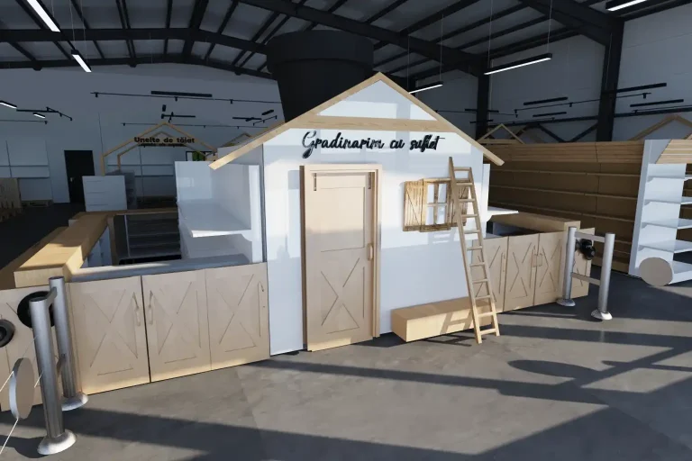
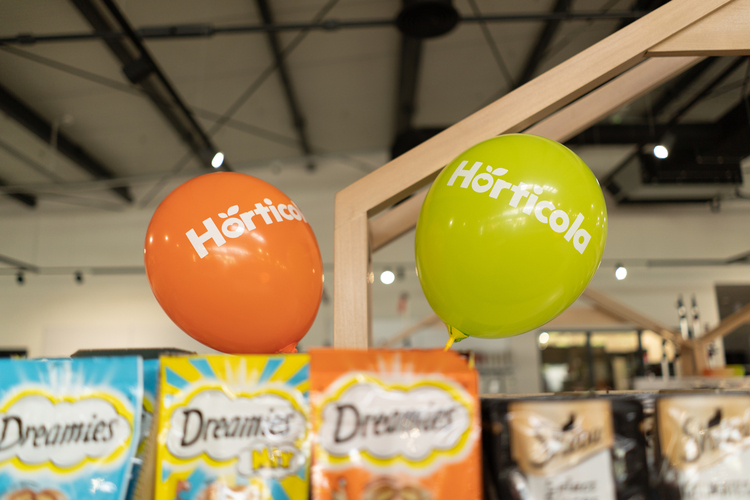
The Concept & Mood A Blend of Minimalism and Art Deco Elegance This project for Horticola Garden Store aimed to transform a retail space for gardening supplies into an unexpectedly warm and inviting environment. The design successfully marries a fresh,...