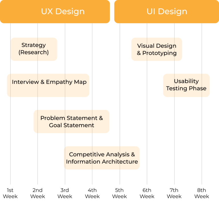
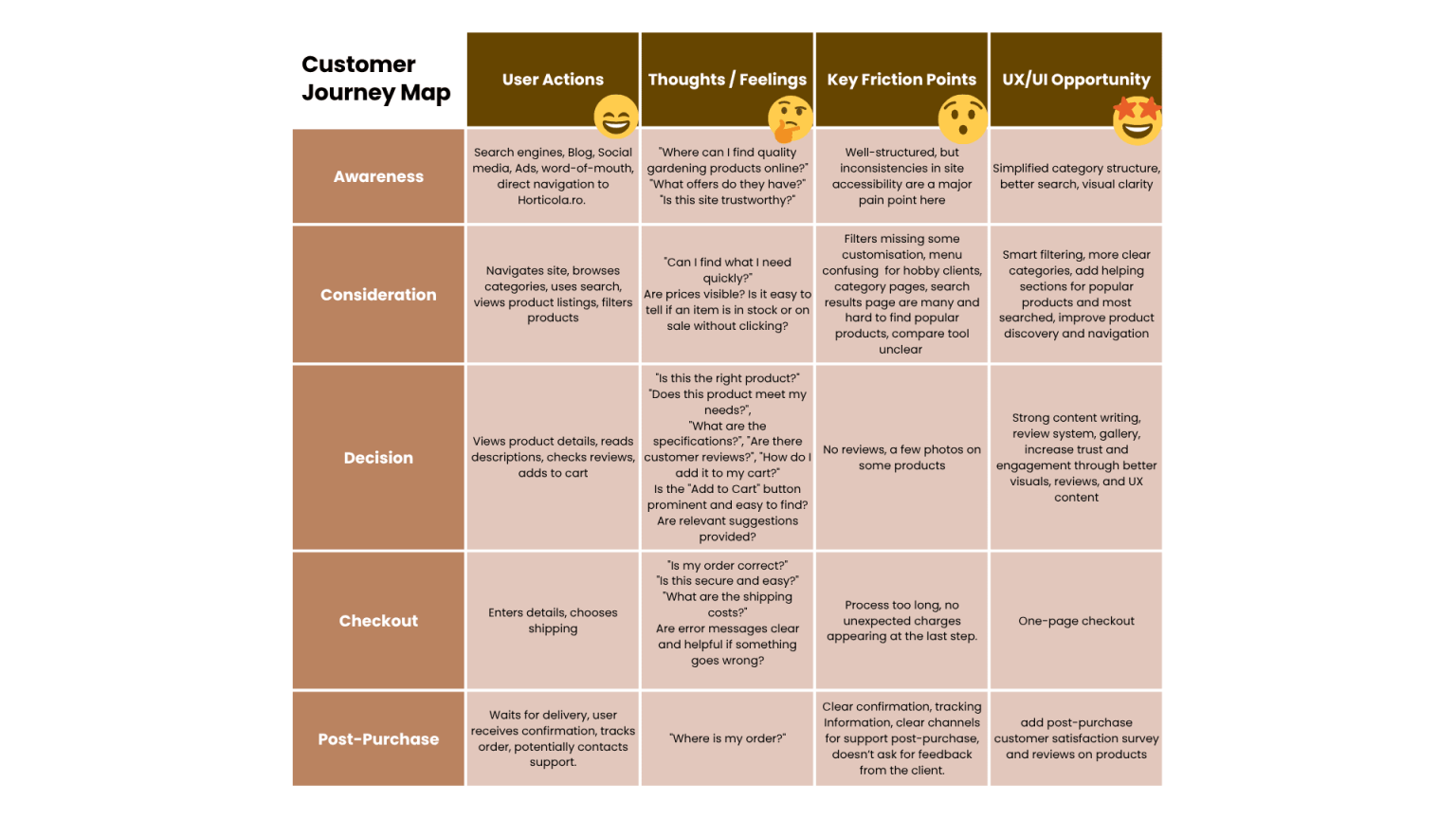
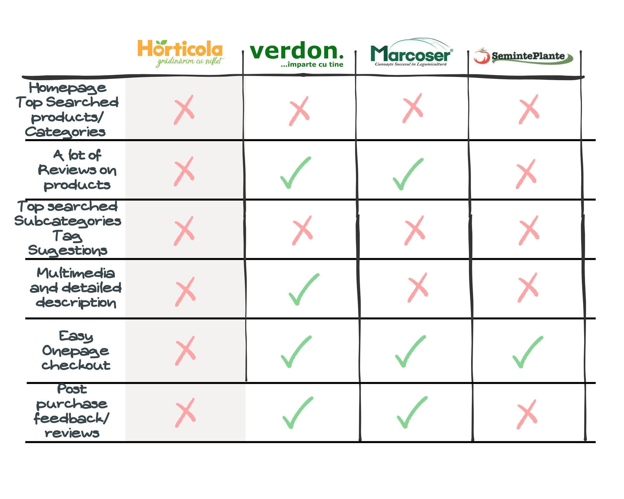
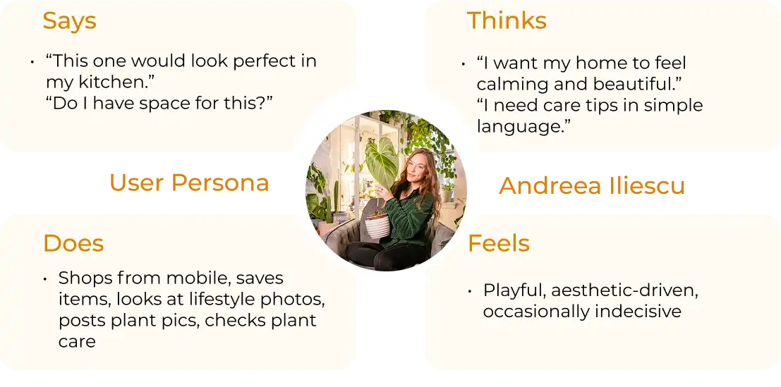
Assess whether users can easily navigate the website.
Determine how effectively users can find, understand, and purchase products (e.g., seeds, pesticides, tools).
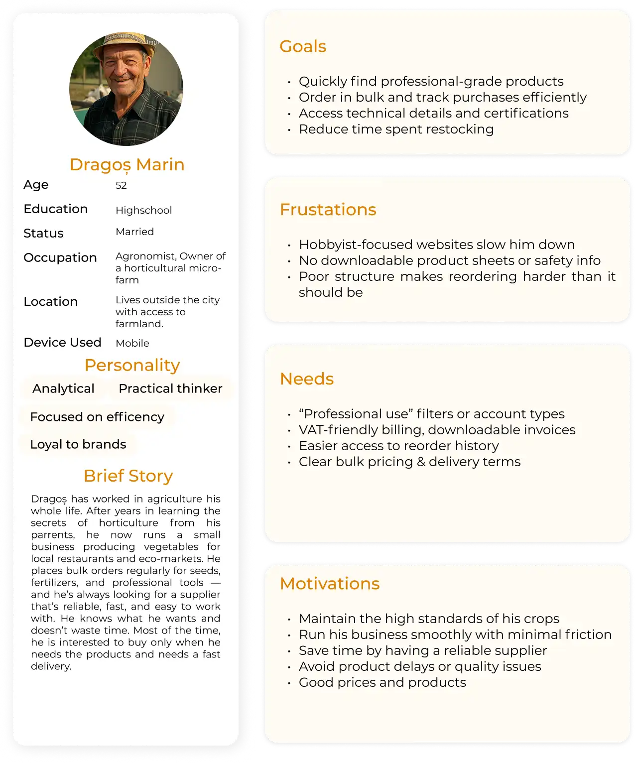
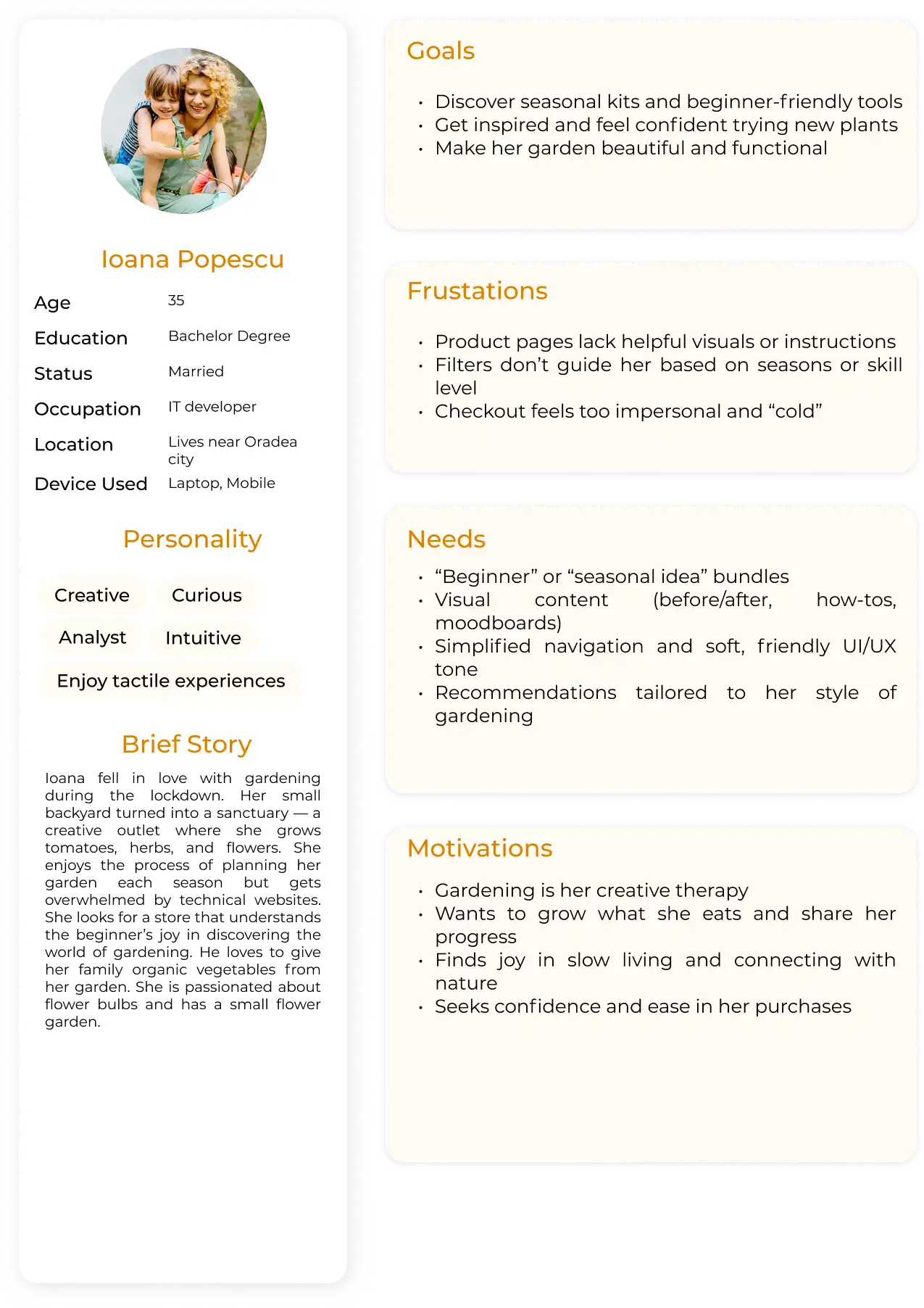
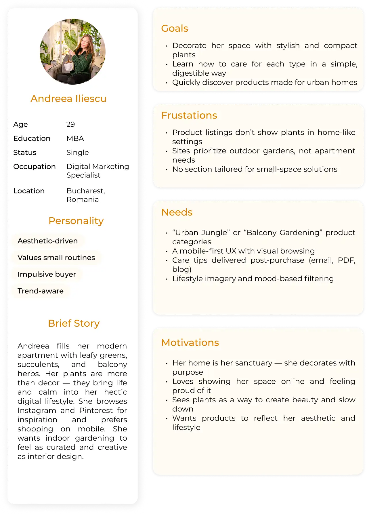
Evaluate the clarity of product information, particularly for novice users.
Identify usability issues, especially on mobile devices, which account for 80% of traffic.
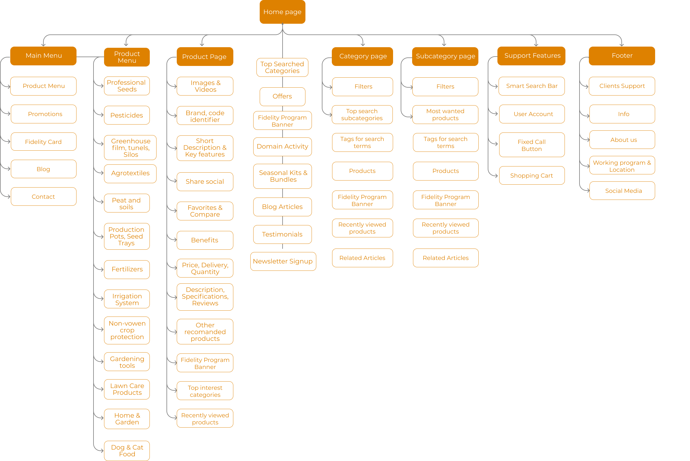
- Add new futures for better website navigation journey


After
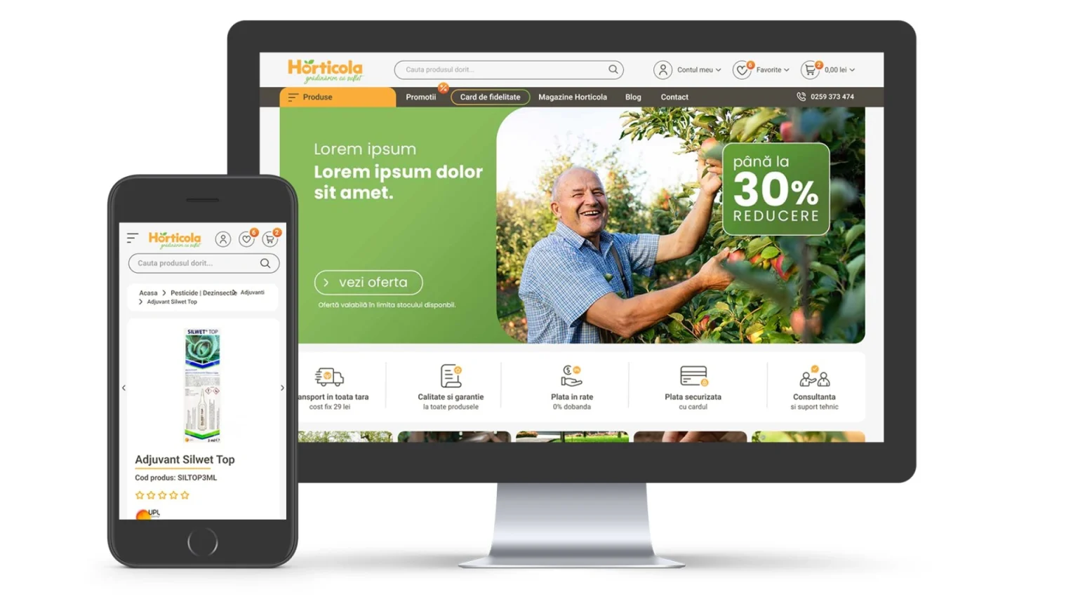
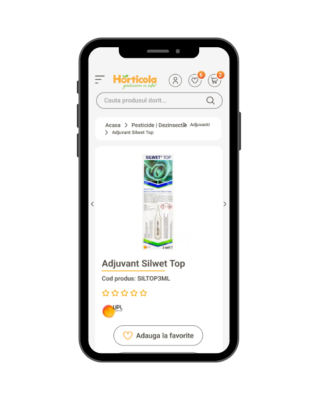
Before
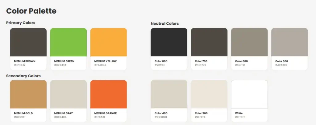
- Branding
- Graphic Design
- Interior & Product Design
- Marketing
- Photography & Videography
- UX & UI design
- Visual Identity
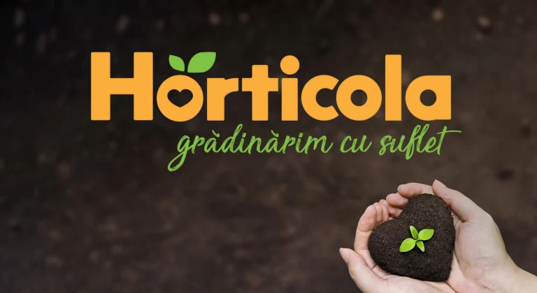
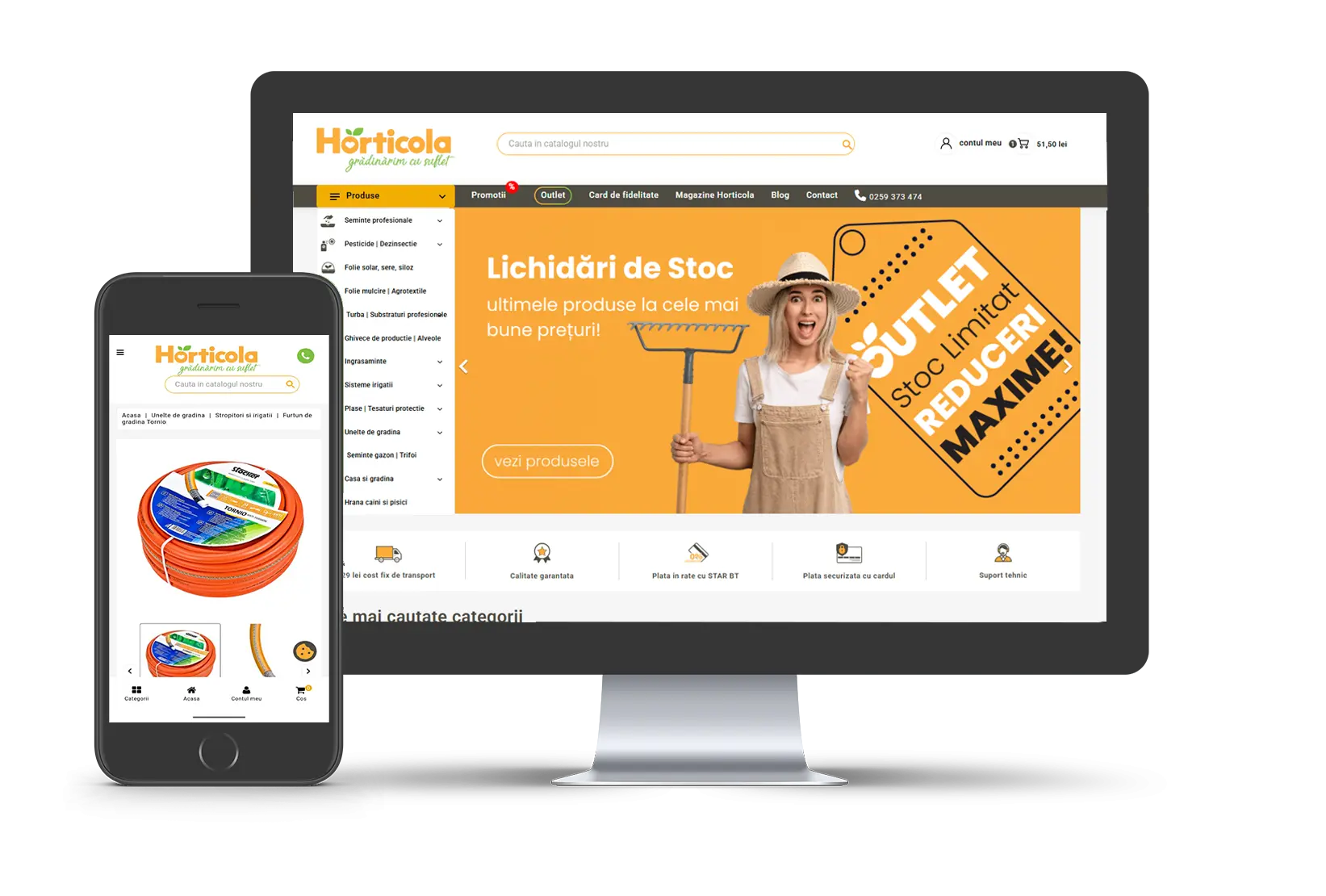
Rebranding Concept Project type: Rebranding Role: Brand designer Industry: Gardening, Horticulture Tools used: Illustrator, Photoshop, Canva. Horticola is a phytopharmacy and agricultural store specialized for horticulturists, skilled gardeners, but also for anyone who wants a small urban garden. The brand...
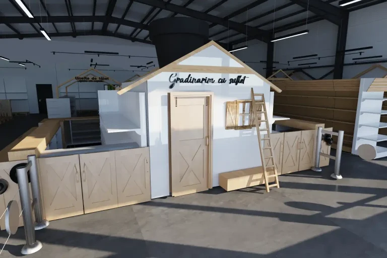
The Concept & Mood A Blend of Minimalism and Art Deco Elegance This project for Horticola Garden Store aimed to transform a retail space for gardening supplies into an unexpectedly warm and inviting environment. The design successfully marries a fresh,...