
Branding Concept
Project type: Visual Identity
Role: Brand designer
Industry: Fast Food Restaurant, Bistro
Tools used: Illustrator, Photoshop, Corel Draw.
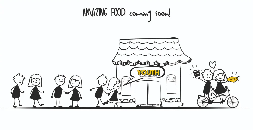
Youth concept it’s all about serving comfort food that’s as fresh and satisfying as your favorite guilty pleasure – but with a twist! Whether you’re grabbing breakfast on the go or need a quick, tasty lunch to fuel your day, Youth has is covered with unique offerings crafted especially for young people to have their lunch break. The fast food is located in Oradea city center, near important colleges.
The menu includes:
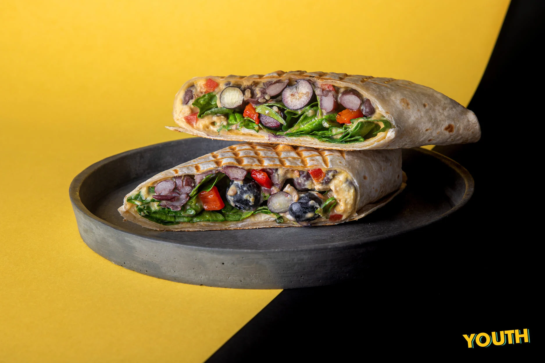
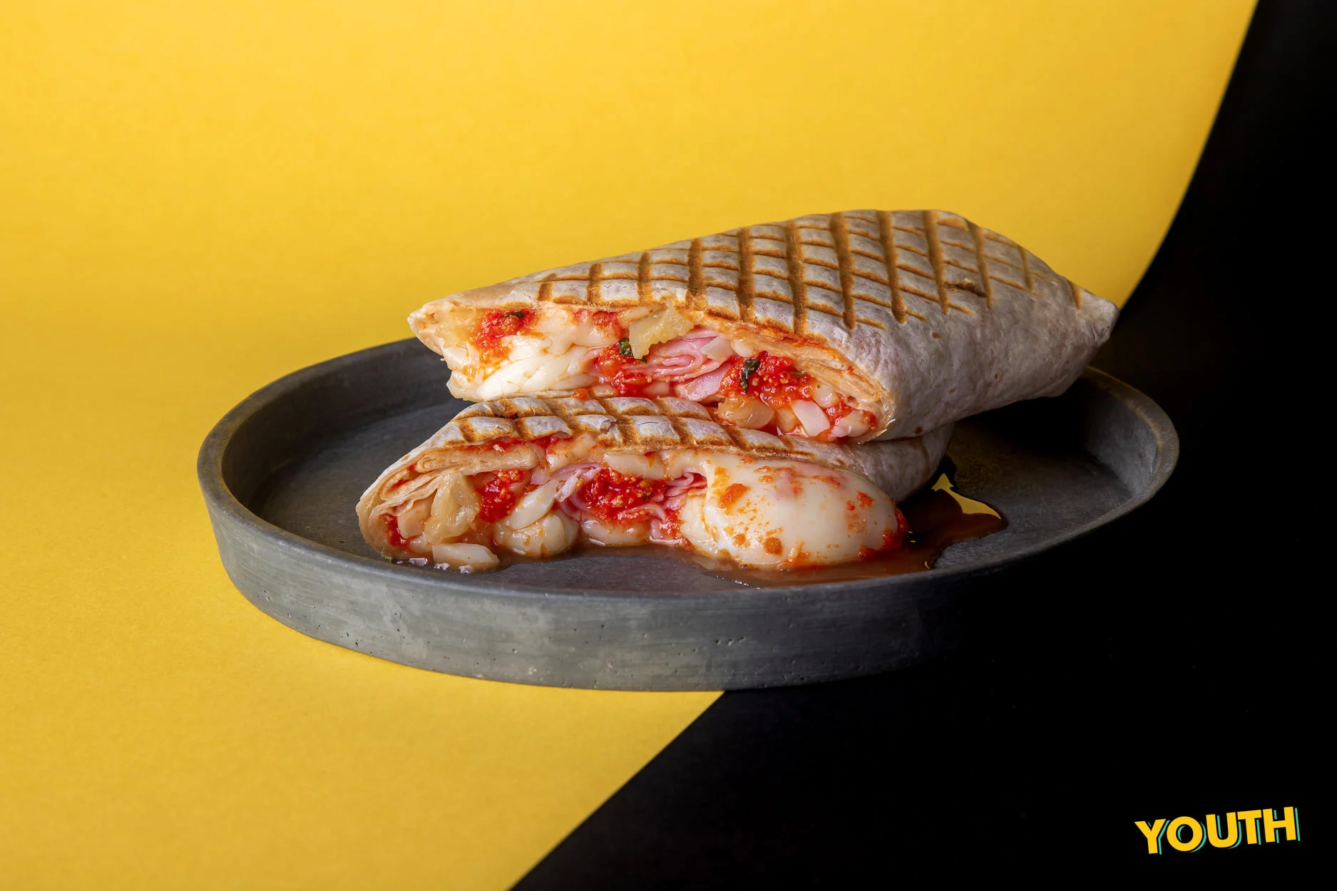
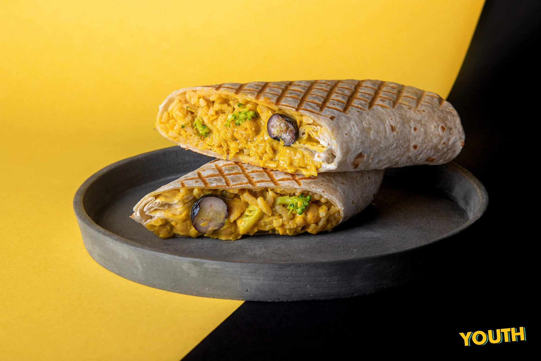
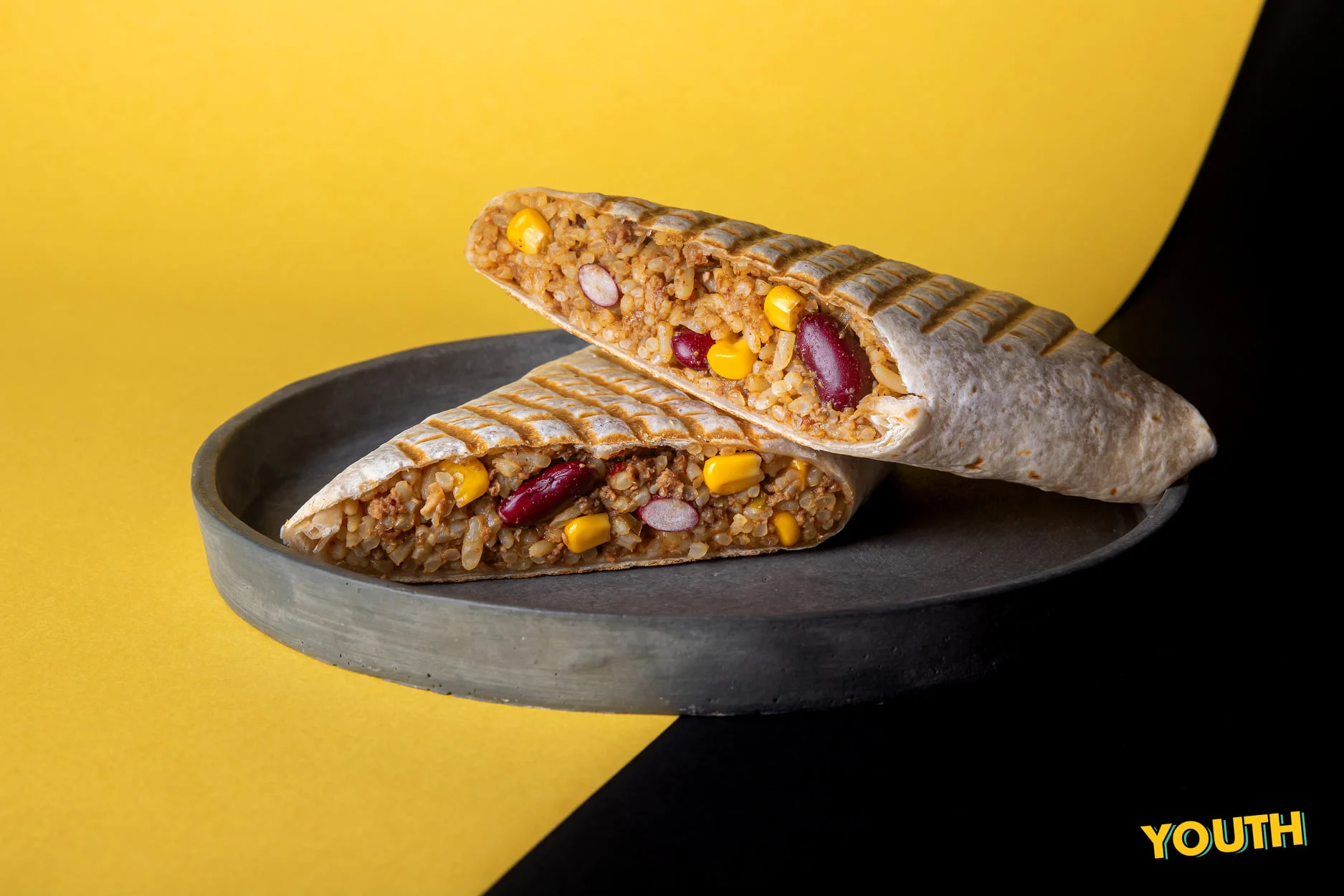
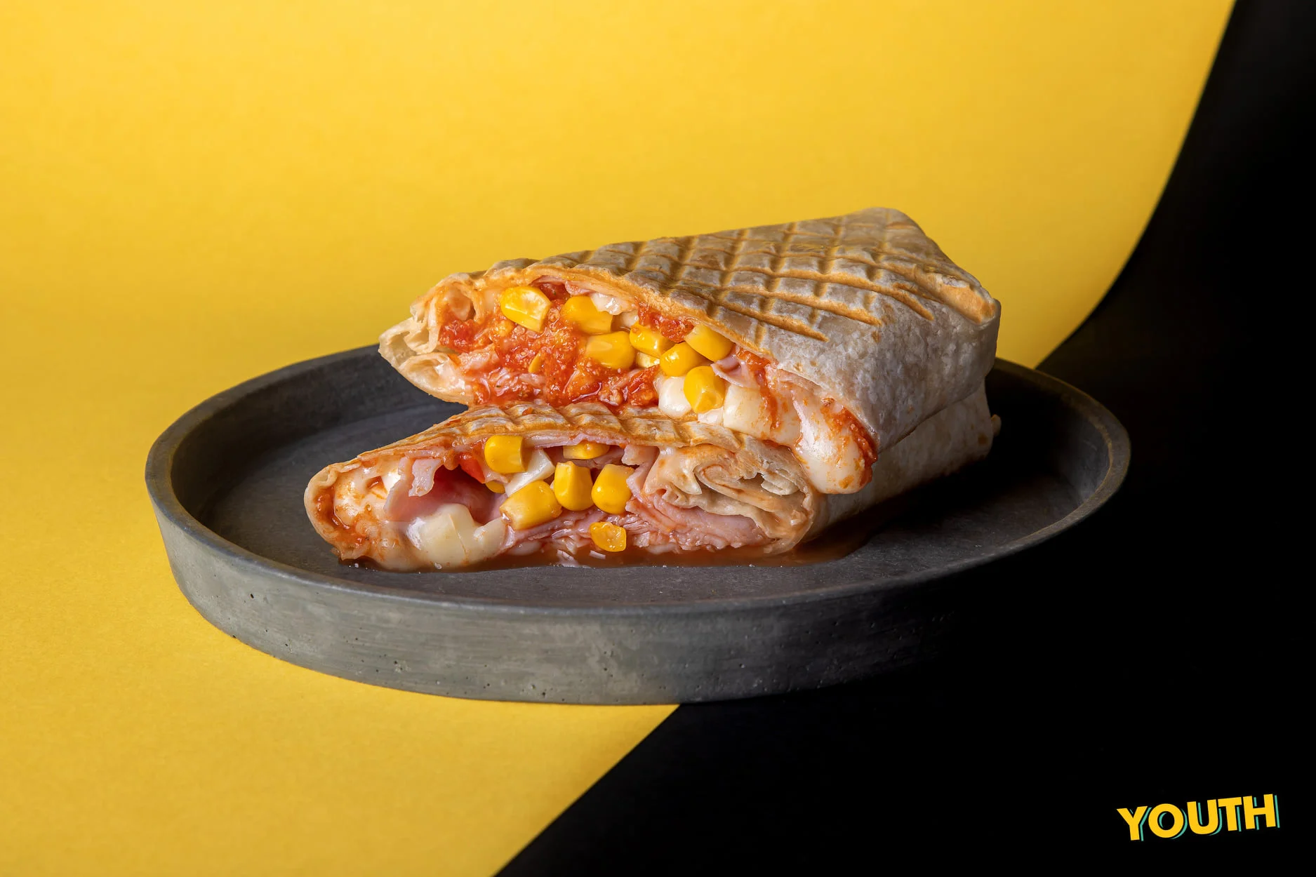
- Tortilla Sandwiches – A delightful, handheld fusion of flavors that’s perfect for any occasion.
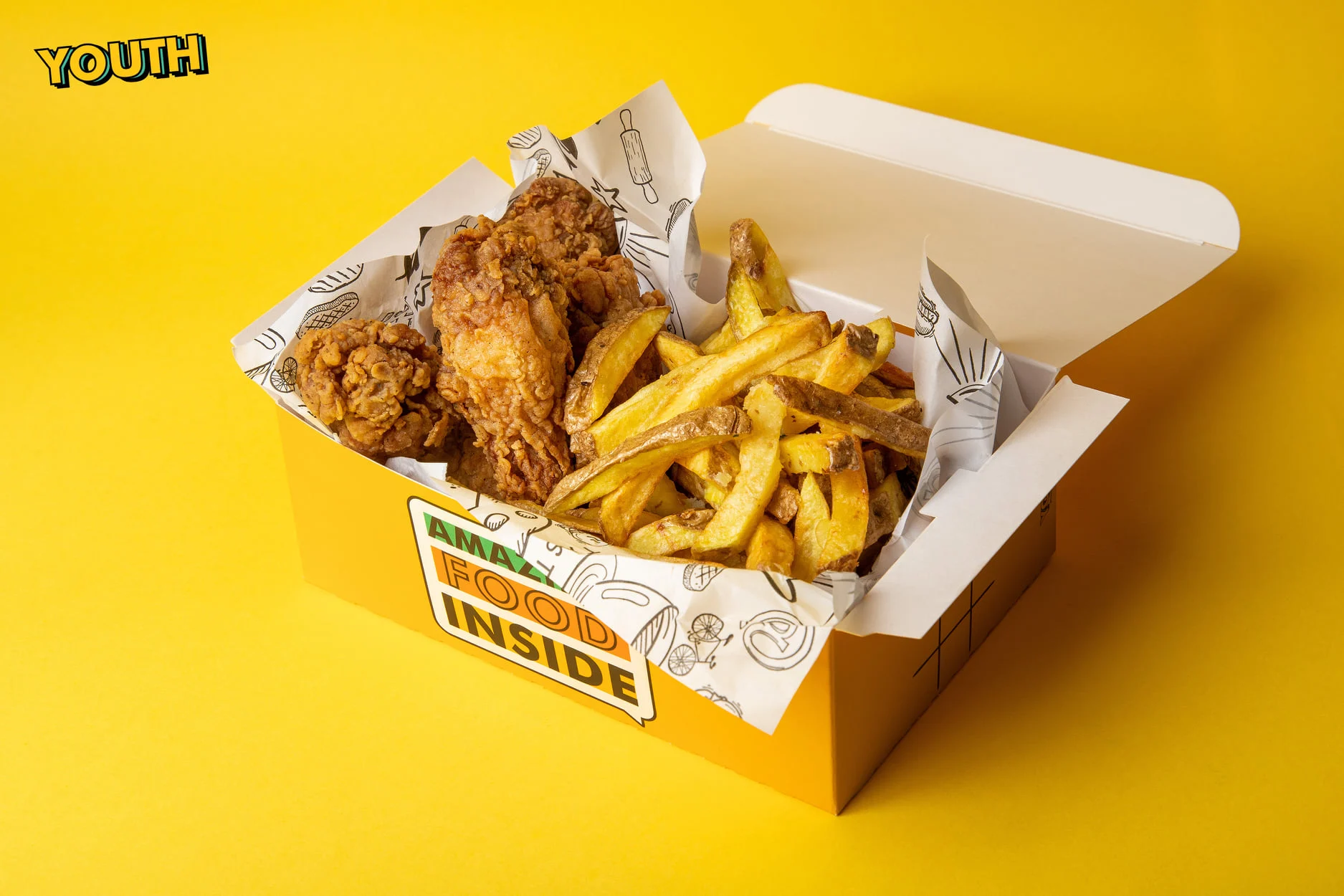
- Crispy Strips & Wings – Crunchy, golden perfection that satisfies every craving.
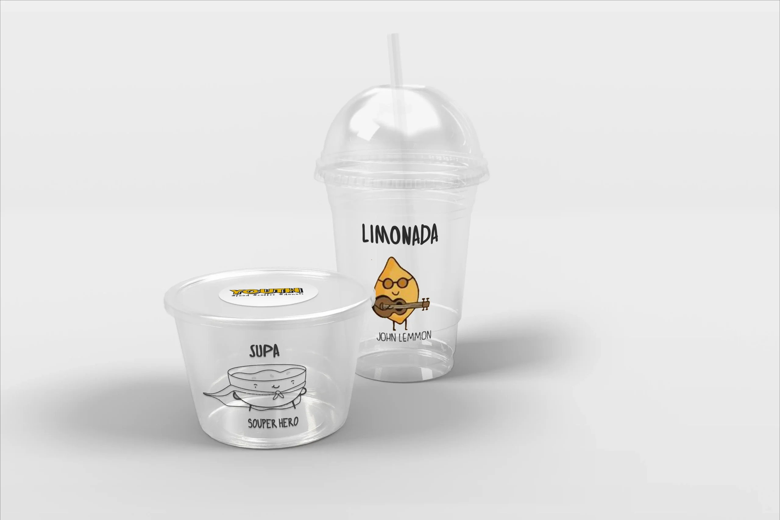
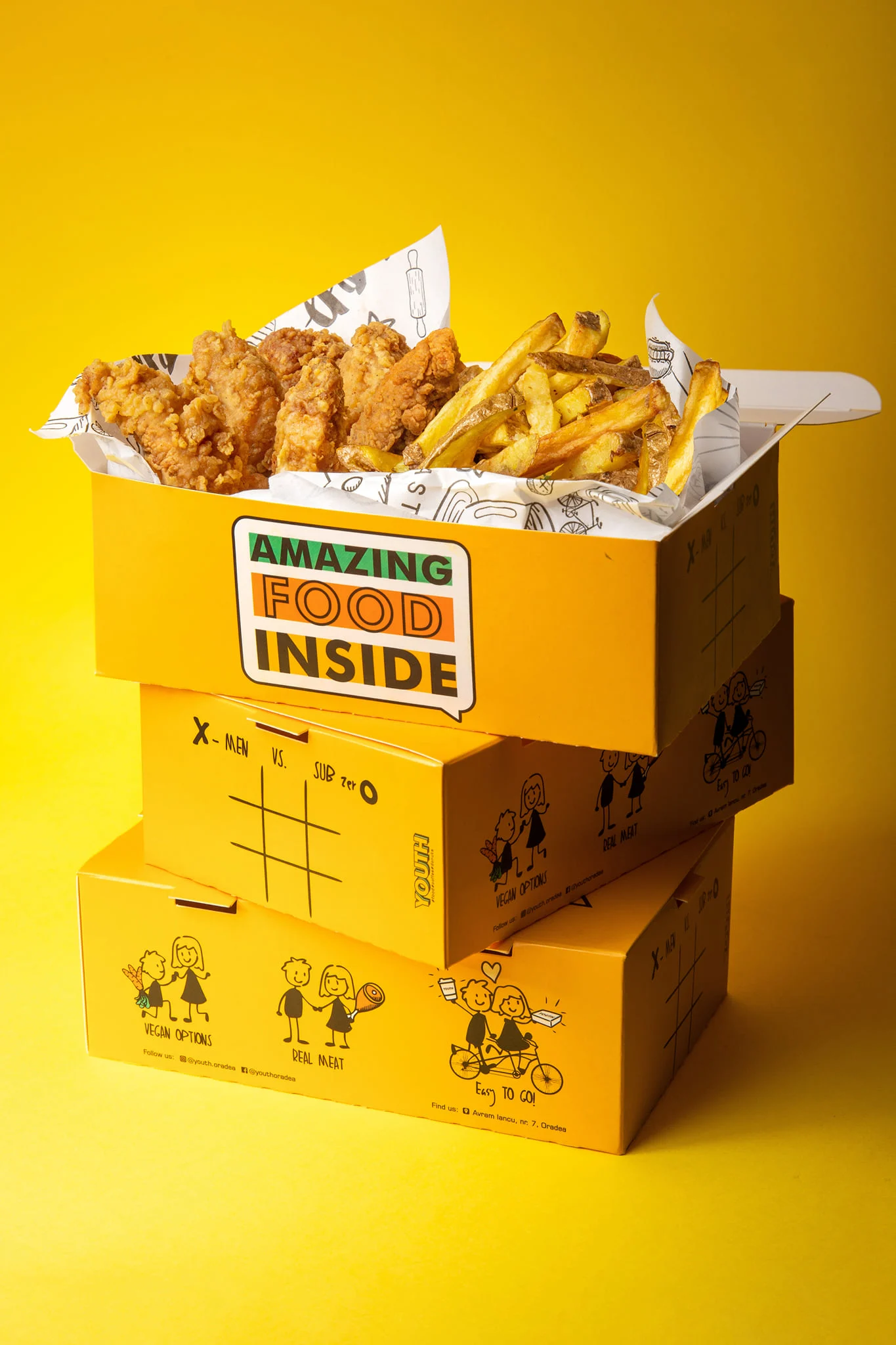
- Fries – Homemade with love and seasoned to perfection, always crispy and served with the skin on.
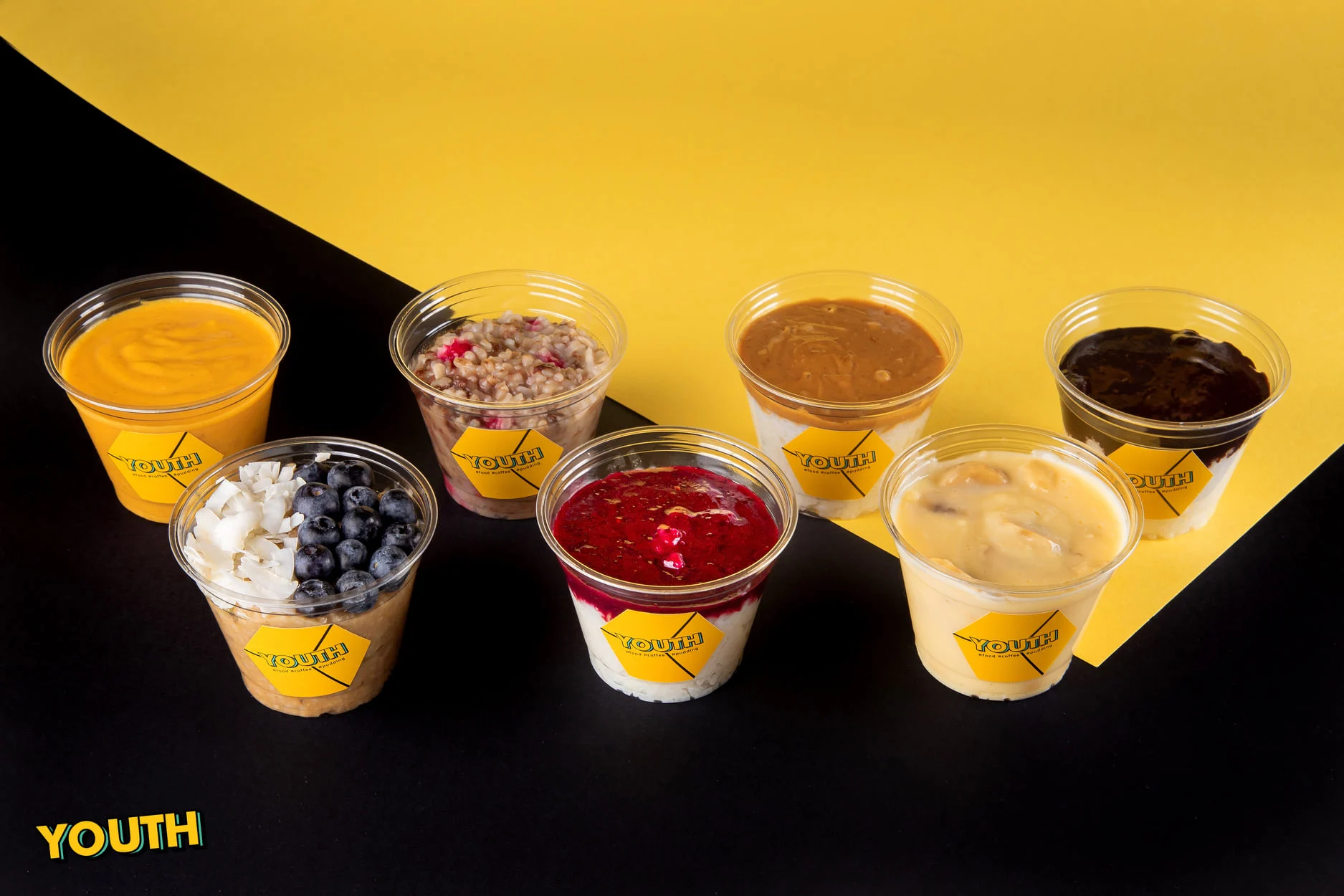
- Pudding – A sweet treat to end your meal with something indulgent and comforting.
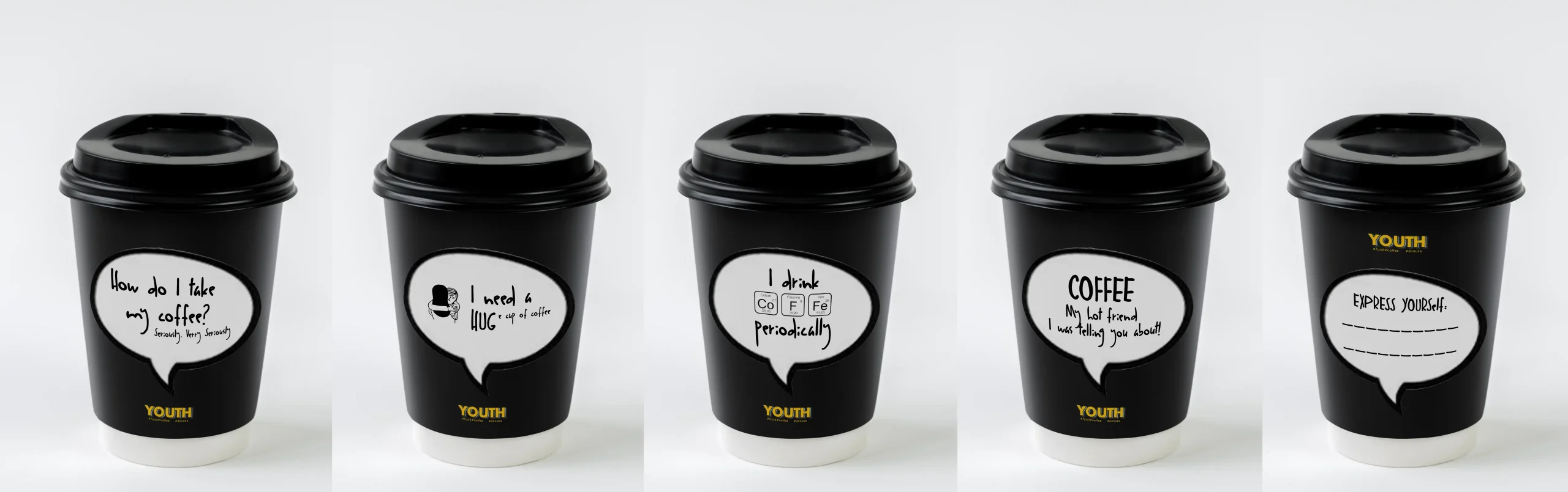
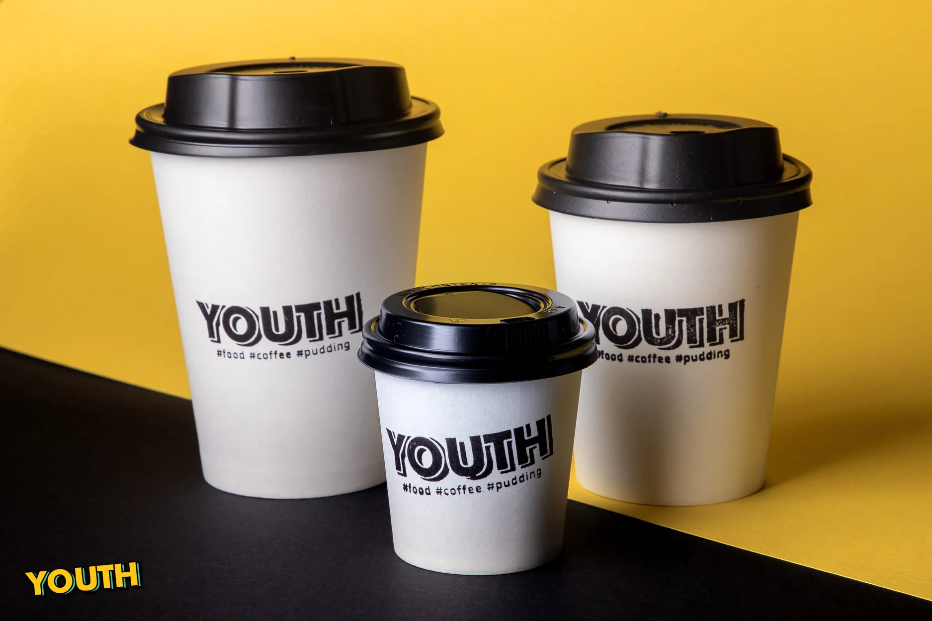
- Coffee – Start your day with a boost or enjoy it with a bite, perfectly brewed for you.
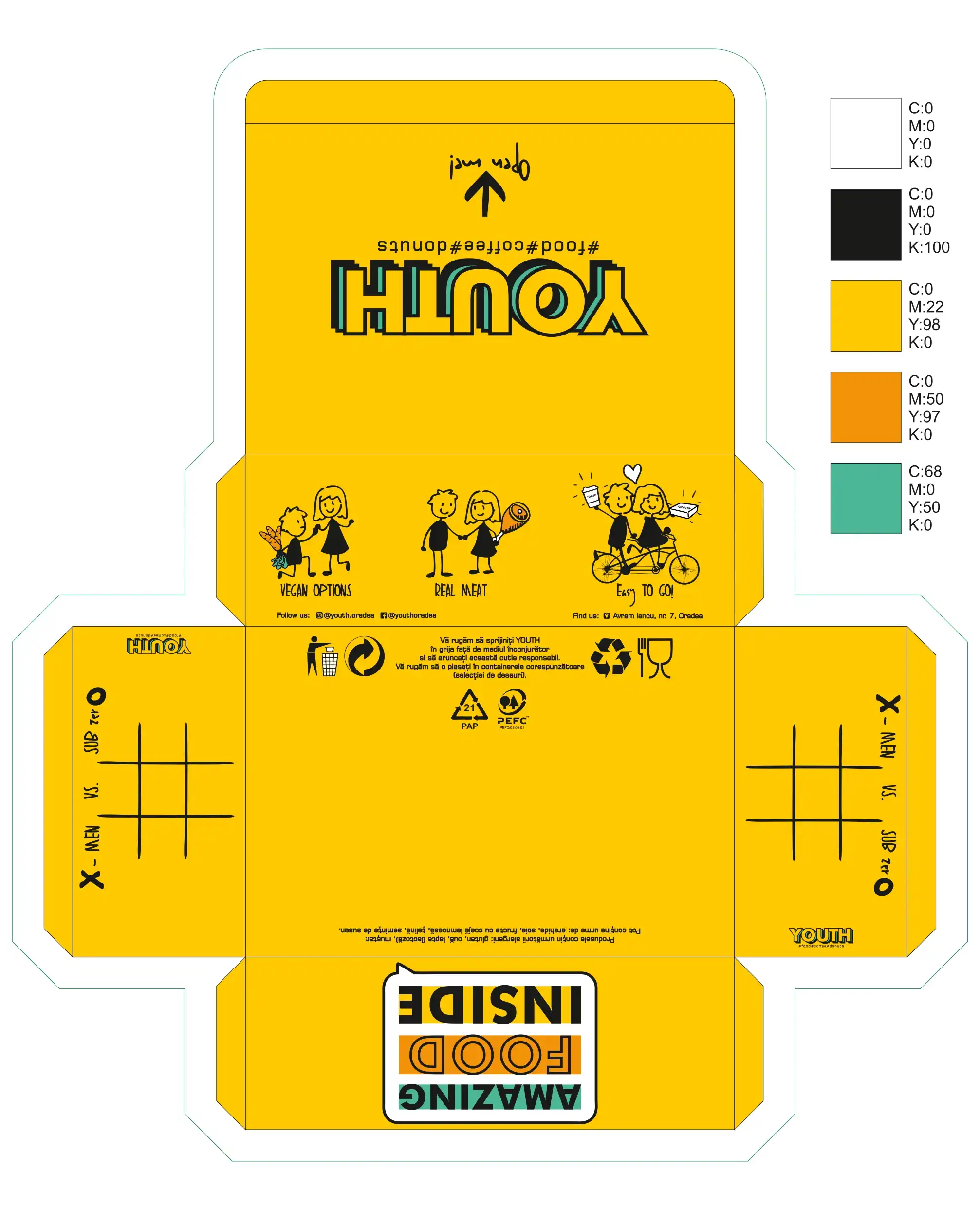
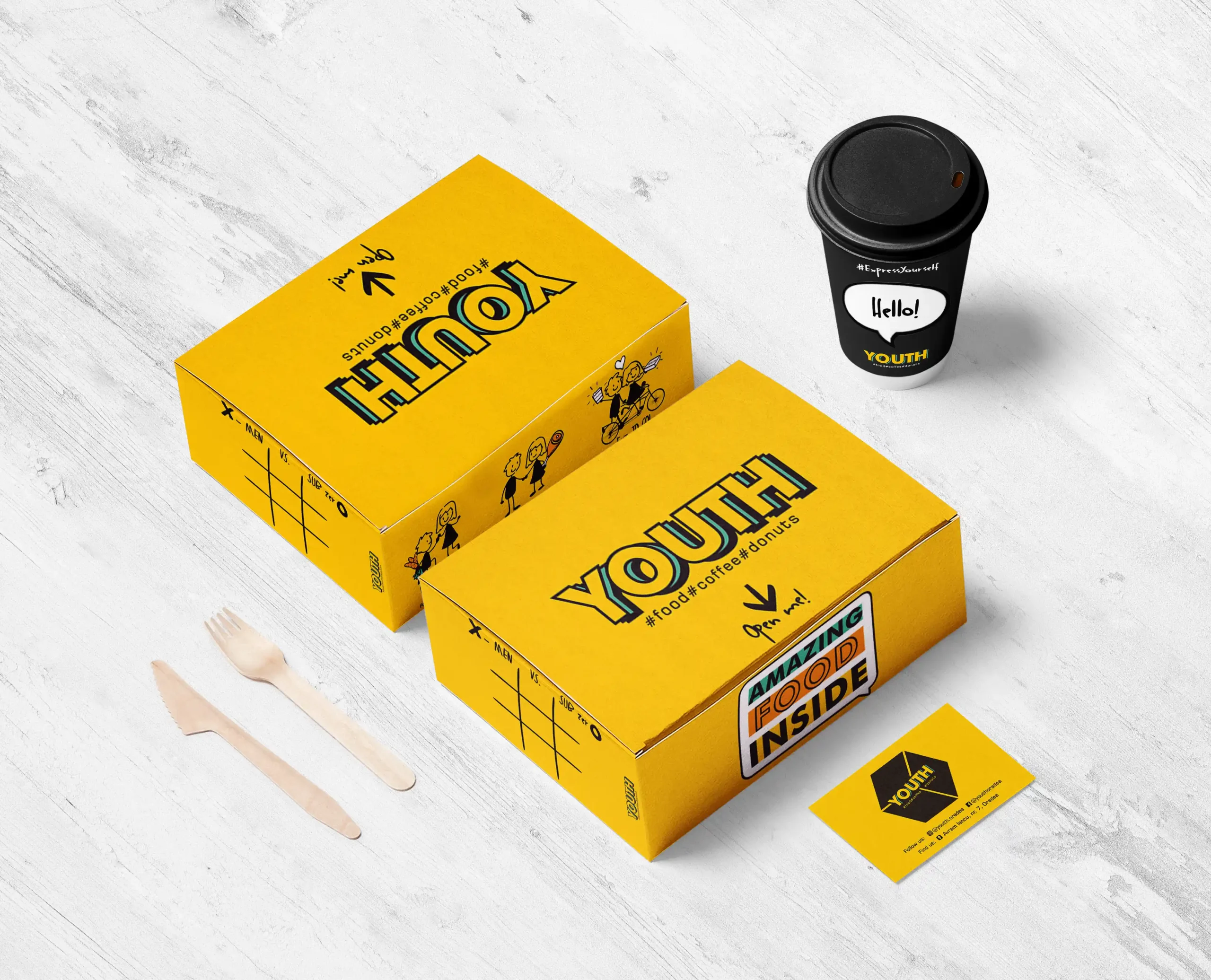
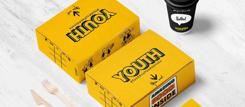
- YOUTHBox – Take your favorite meal anywhere – whether you’re chilling at home, working, or on a dog walk, our YOUTHBox brings comfort wherever you are.
They use only local ingredients and clean, simple recipes. Here you can taste our fresh meats and homemade fried potatoes. No shortcuts, just the best comfort food you didn’t know you were craving!
YOUTHbox can be easily delivered, or picked up and enjoyed at home with friends, Netflix, or your favorite video game. It’s all about great food, great vibes, and convenience. Comfort food, your way.
Logo Elements
YOUTH is a fresh, dynamic, and playful brand that embodies energy, creativity, and a modern lifestyle. The visual identity is designed to appeal to a young, vibrant audience, blending bold aesthetics with a sense of fun and authenticity.
The brand conveys an adventurous spirit, inclusivity, and a love for experiences. Every element of the design—from the logo to the color palette—aims to evoke excitement, curiosity, and engagement.
The design takes a modern and playful approach, combining bold typography, energetic colors, and engaging graphic elements. The branding avoids rigid structures, instead embracing fluidity and movement to reflect the free-spirited nature of youth culture.
The overall aesthetic balances a clean, contemporary feel with artistic elements that add personality and a sense of uniqueness.
Typography
- The logo is dynamic, designed with youthful energy in mind. It features bold, clean lines with a slightly playful twist, making it instantly recognizable and impactful.
- The typography follows a modern sans-serif style with a slight geometric influence, ensuring readability while maintaining a fresh and trendy look.
- Supporting fonts include rounded or hand-drawn styles for added playfulness, reinforcing the brand’s friendly and engaging personality.
Design Elements
To emphasize the brand’s personality, the design includes:
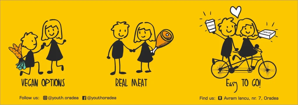
- Custom Illustrations & Characters: Playful, cartoon-inspired elements that add a sense of fun and approachability.
- Dynamic Layouts: Asymmetry, bold overlays, and interactive visuals to maintain excitement and engagement.
- Iconography & Patterns: Hand-drawn or geometric patterns that complement the typography and add extra personality to marketing materials.
The YOUTH brand identity is designed to be versatile and adaptable across various platforms, including:
- Social Media: High-impact graphics with bold typography and animations.
- Packaging & Merchandising: Playful branding applied to product packaging, apparel, and promotional materials.
- Print & Digital Media: Engaging posters, menus, and marketing materials that maintain consistency across all touchpoints.
Chromatic Variants
The chromatic approach embraces vibrant and energetic hues, reflecting creativity and excitement. The palette consists of:
- Primary Colors: Bold, eye-catching shades like electric blue, bright yellow, or fiery orange, symbolizing enthusiasm and optimism.
- Secondary Colors: Softer, pastel tones or neutral shades to provide balance and contrast, ensuring a visually appealing composition.
- The color combinations create a strong visual impact, emphasizing contrast and movement, reinforcing the brand’s youthful and dynamic nature.
Usage & Applications